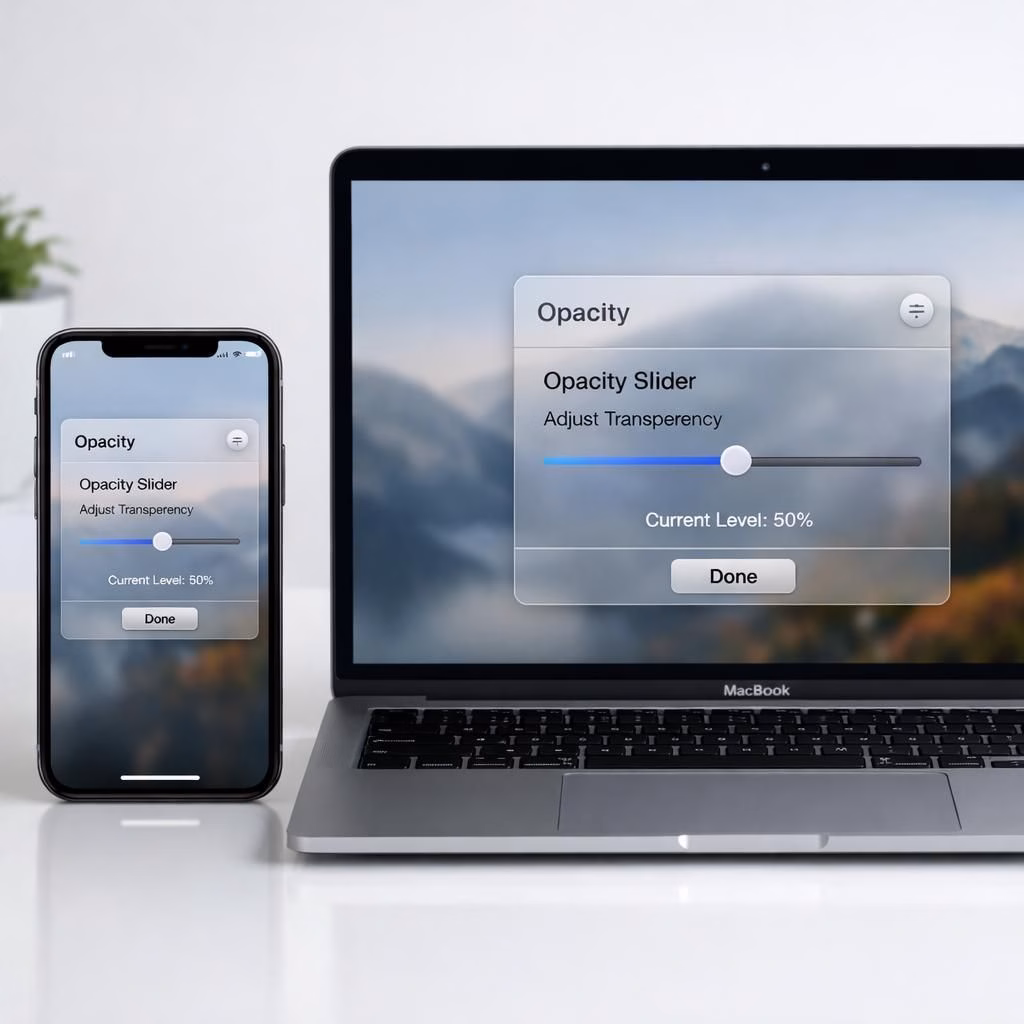
In a move that feels like an espresso shot for designers and power users, Apple updates Liquid Glass with iOS 27. The system-wide opacity slider now lets you dial from fully opaque to crystal-clear, giving users real control over transparency. Sidebars stretch to the window edge and refraction remains beneath them, a premium touch that stays readable rather than shimmering into glare.
Liquid Glass in iOS 27: System-Wide Opacity Upgrade
The iOS 27 slider is the center of gravity for this redesign. Where iOS 26.1 offered a narrow Clear/Tinted toggle, iOS 27 replaces that with a full continuum. Users can tune every corner of the system: widgets, search bars, notification areas, and content panels all respond to the same input. The result is more legible typography and clearer content separation when multiple apps are open.
Depth is no longer an afterthought. The update sharpens the cadence of UI elements so you can distinguish between a text block and a card at a glance. The translucent material now supports stronger depth cues, improving readability in bright environments and addressing earlier glare issues. The slider’s reach is system-wide, so developers don’t need separate opacity tweaks for dialogs, panels, and controls.
macOS Golden Gate: Edge-to-Edge Refinement and Color Integrity
macOS Golden Gate mirrors the iOS 27 approach with a thoughtful twist. Sidebars now extend to the edge of the window, and refraction continues beneath them, making the desktop feel less boxed in. Sidebar icons retain their color rather than bleeding into the backdrop, improving contrast and ensuring quick recognition even as the opacity slider changes. This small but meaningful improvement helps reduce visual fatigue and makes navigation more intuitive for both daily tasks and power-user workflows.
On the icon front, Apple continues layering Liquid Glass into app icons themselves. The depth adds a premium touch without sacrificing recognizability, aligning with the unified icon system rolled out across iOS, iPadOS, and macOS last year. You’ll notice icons stay legible as you tweak global opacity, helping you keep a mental map of where things live in busy workspaces.
Two Layers, One Cohesive Experience: Cross-OS Consistency
The iOS 27 and macOS Golden Gate efforts aren’t isolated experiments. Apple emphasizes a cross-OS language—Liquid Glass—that ties the user experience together across devices. This means less guesswork when you switch from iPhone to Mac, since the opacity slider, refraction behavior, and icon depth behave consistently. It’s not just about aesthetics; it’s about reducing cognitive load so users can focus on content rather than UI quirks. In practice, this translates to fewer dialog-box surprises, more predictable typography, and a better sense of depth in every app you open. The end result is a more approachable, less polarizing interface that still feels premium and modern in 2026.
From Toggle to Tuning: Replacing Old Presets with a Smooth Slider
The move away from iOS 26.1’s Clear/Tinted presets to a full-spectrum slider is a deliberate shift in Apple’s design philosophy. Presets simplify choices but can frustrate power users who want precise control; a slider provides both accessibility and nuance. With iOS 27 and macOS Golden Gate, you’ll experience fewer abrupt transitions and more gradual improvements as you adjust. The system-wide approach means a single tweak yields a harmonized result, whether you’re in a dimmed theater mode or a bright daylight workspace. The practical effect is a UI that feels deliberate rather than accidental, and a user experience that adapts to your environment rather than forcing you to adapt to it.
Developer Betas, Public Beta, and a September Release: What to Expect
Developer betas for iOS 27 and macOS Golden Gate are available now, with a public beta arriving soon and a traditional September public release on the calendar. This cadence mirrors Apple’s past pattern: early access for developers, broader testing for the public, and a final polish before launch. The team stresses that user feedback shaped this update—clear signals from designers and everyday users helped refine readability, layering, and color integrity. If you enjoy a transparent UI that still respects content, you’ll likely welcome the ongoing refinement that comes with this phased rollout.
Beyond the slider itself, the broader feedback loop highlighted a tension: the original Liquid Glass concept promised novelty, but it needed practical readability. The 2026 iteration aims to balance ambition with usability, delivering a transparent veneer that stays legible and comfortable across tasks. As with any large UI change, early adapters test edge cases; the rest of us will settle into a more consistent Apple UX rhythm.
Practical Tips: Getting the Most from Liquid Glass in 2026
To make the most of the new system-wide opacity slider, start with a comfortable baseline in well-lit rooms, then fine-tune for reading sessions. If you spend long hours with text-heavy apps, push the slider toward higher opacity to maximize contrast. For creative tasks, you can experiment with greater transparency to better perceive color relationships as they interact with glass-like surfaces. The goal is readability first, with the glass serving as a subtle depth cue.
As you navigate between iOS 27 devices and macOS Golden Gate machines, you’ll notice a shared vocabulary: depth cues, color retention in icons, and edge-to-edge surfaces that feel deliberate rather than decorative. The result is a more cohesive ecosystem where the UI supports your tasks rather than distracting you from them.
FAQ
- What is Liquid Glass in simple terms? It’s a translucent UI surface that adds depth and layering to elements like text, icons, and panels.
- How do I adjust the system-wide opacity? Use the new iOS 27 slider across the OS; changes apply to widgets, dialogs, and app content.
- Will this affect accessibility? The goal is improved readability; if needed, you can push opacity toward higher contrast while preserving depth.
- When can I expect the final release? Betas are out now, with a public beta soon and a September release expected for both platforms.
The original Times of India article that inspired these notes is included in the References below. We appreciate the reporting and encourage readers to review the source for details.
Conclusion: A More Readable, Consistent Glass
Liquid Glass on iOS 27 and macOS Golden Gate aims to balance transparency with readability, depth with clarity, and style with practicality. The slider makes the experience personal rather than preset, while edge-to-edge sidebars and color-true icons keep navigation intuitive. If you value a premium feel that respects content, the updated Liquid Glass UX is worth trying across devices in 2026.
References
- Times of India — Apple gives Liquid Glass a do-over at WWDC 2026
- Apple Newsroom
- TechCrunch
- The Verge