

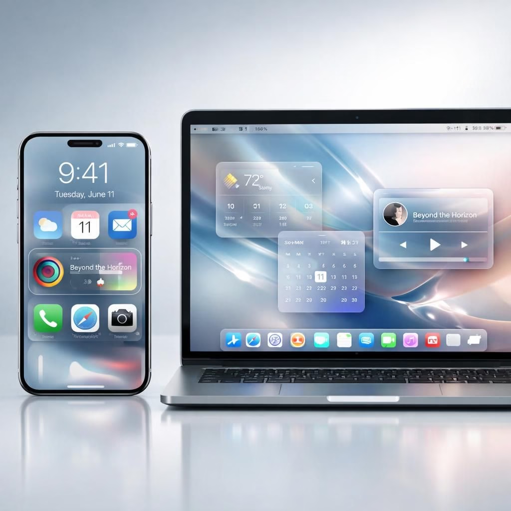
In this sunny look at Apple’s Liquid Glass interface and its Tag B evolution, we celebrate how the glassy UI reframes navigation without sacrificing clarity. The glassy look debuted with iOS 26 at WWDC 2025, and Apple has tended to lean into refinement rather than dramatic revolutions since then. Bloomberg’s Mark Gurman, writing in Power On, notes that the latest internal builds of Tag B and macOS 27 show no seismic redesigns of the glass-era. The result is not a reset, but a patient, almost charming, evolution. The team behind the look includes Steve Lemay, Apple’s new design chief, along with Chan Karunamuni, who led the WWDC session that explained the changes. This wasn’t a lone designer’s dream; it’s a company-wide, multiyear effort rooted in the visionOS design work that predates iOS 26 by years. If you like your UI with a little transparency and depth, this is a story you can enjoy while sipping your latte and scrolling through apps.
What makes Liquid Glass feel different isn’t just the glow; it’s the way the layers play with light and motion. The transparency-heavy treatment traverses navigation bars, buttons, icons, and widgets, creating a cohesive language that can read cleanly from lock screen to system dialog. Some users initially raised readability concerns when the glass got busy, but the overall adoption has climbed steadily. The design team has acknowledged the balance between beauty and legibility, and they’re exploring options to keep both intact. The current conversation hints at something more ambitious: Tag B a system-wide intensity control that could harmonize contrast, readability, and aesthetics across the entire device. That would be a major step toward a unified Glass experience, and it would likely require careful tuning to avoid turning the interface into a kaleidoscope every time you unlock the phone.
Liquid Glass in Focus
What does this mean for everyday use? The Liquid Glass aesthetic centers on transparency and layered depth, crafting a sense of space that can feel expansive yet calm. Most users tolerate the glassy look well, though some early feedback pointed to moments when overlays felt a touch busy. The response from Apple’s designers has been practical: refine the opacity controls, adjust edge cases, and push for consistent legibility. The talk of a potential system-wide intensity slider is exciting because it could harmonize visuals with legibility across apps, contexts, and lighting conditions. If Apple can nail that balance, we might see fewer edge-case complaints and more appreciation for the UI’s modern, almost architectural elegance. The path forward mirrors the way iOS 7 reshaped expectations years ago—through iteration, user feedback, and time. Liquid Glass appears to be on a similar journey, inching toward a stable, broadly loved equilibrium.
iOS 27: The Next Glass Era
Looking ahead, Tag B could bring a system-wide Liquid Glass intensity control, extending the glassy look beyond current toggles and independent clock opacity settings. Presently, users can switch between Clear and Tinted modes and tweak the lock screen clock’s opacity. The next leap would be a global slider that regulates the glass density everywhere—across home screens, notifications, and system menus—while preserving readability. Apple’s approach here is as much about architectural consistency as about aesthetics. The design leadership—Steve Lemay, Chan Karunamuni, and a cadre of seasoned contributors—keeps Liquid Glass alive even when leadership shifts occur. The broader plan connects iOS, macOS, and visionOS in a shared language, suggesting a multi-year mission to unify the visual vocabulary across devices. If the system-wide slider lands well, it could become the poster child for how Apple handles bold design without alienating users who prefer simple, legible interfaces with a touch of gleam.
- Adoption vs. readability: a careful balance that may hinge on user-controlled adjustments.
- System-wide controls could offer cross-device consistency and easier customization.
- VisionOS links to this broader design language, reinforcing a unified experience.
- Cross-platform refinement might reduce the friction new UI paradigms often cause.
Two elements smile back from this narrative: the patience Apple shows in refining such a radical aesthetic and the practical willingness to add controls that let users tailor the look to their own taste. Liquid Glass isn’t a finished mural; it’s a living design system that invites tweaks and thoughtful compromises. The aim remains clear: keep the glassy feel while ensuring that every gesture remains precise, every notification legible, and every app still feels like it belongs to the same family. Apple Newsroom provides occasional context for how design trends emerge across platforms, while The Verge and Bloomberg Power On offer ongoing reporting on these evolving interfaces.
For enthusiasts who enjoy the balancing act between beauty and usability, the developments around Tag B promise not just a new coat of glass, but a set of choices that can be tuned to fit different workflows. If Apple succeeds, the result will feel less like a dramatic upheaval and more like a welcome upgrade that respects both aesthetics and daily practicality. The real question isn’t whether Liquid Glass will dominate the next generation of interfaces, but how gracefully it will adapt as features roll out and users discover new ways to interact with the glass in everyday life.
Have thoughts on Liquid Glass or Tag B? Share your perspective in the comments below, and let’s navigate the glassy road together.
Original source: Bloomberg Power On — a sincere thank you to Mark Gurman for the timely, thoughtful reporting that inspired this post.