

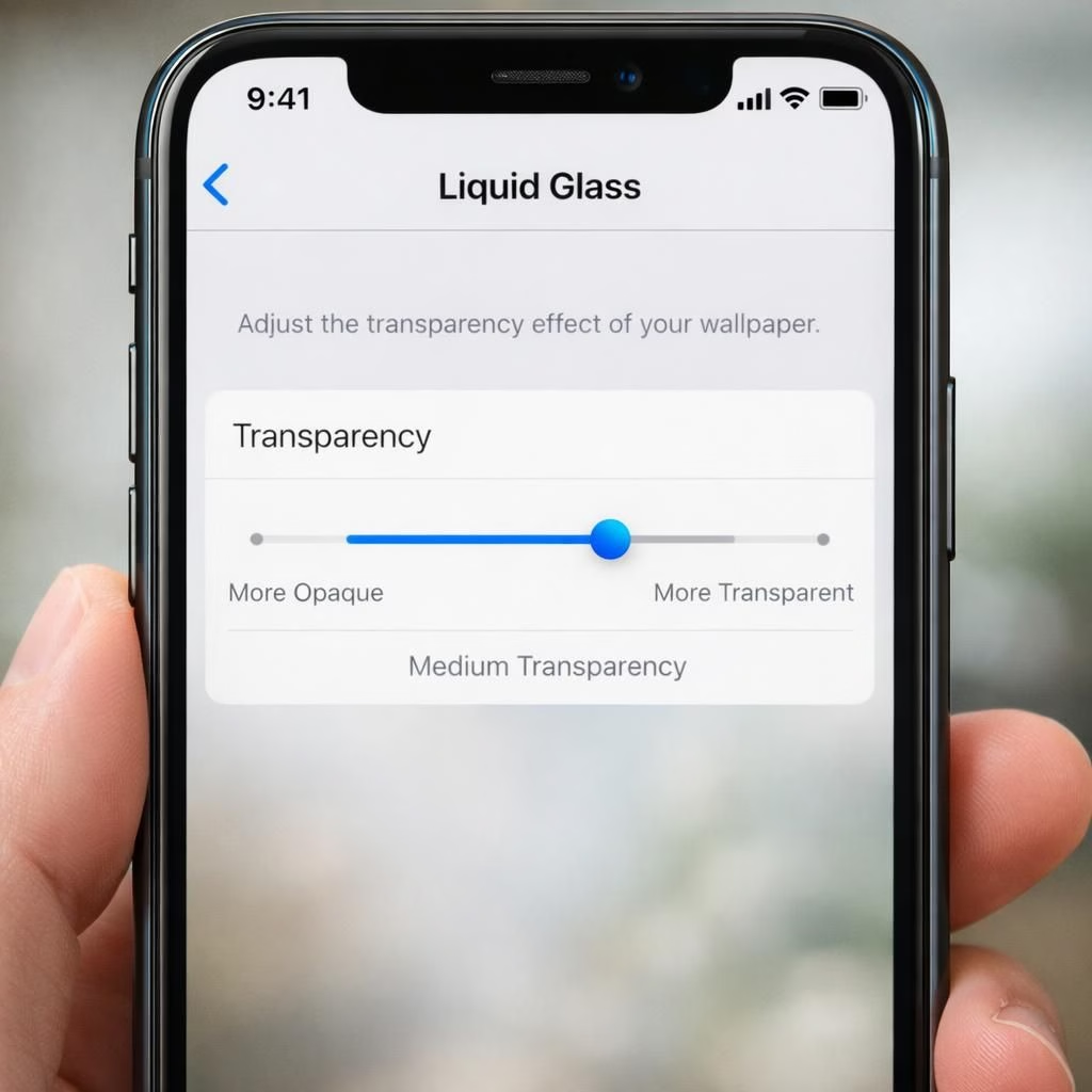
In mid-2026, Apple released the public beta of iOS 27 with a playful, practical feature: a Liquid Glass transparency slider. This tiny knob lets you dial from more transparent to more opaque, letting you tune your iPhone’s glassy personality to taste. Whether you chase legibility or vibe, this slider treats you like an adult and a designer at once.
In Settings under Appearance, tap Liquid Glass to drag left for more transparency or right for more opacity. You can still reduce transparency and increase contrast for accessibility, which is a relief for folks who need crisp text or who value a clean, practical interface.
Liquid Glass and transparency: a design experiment that feels familiar
My week with the beta revealed a range of vibes: the text can warp ever so slightly, icons drift with a gentle parallax, and the overall depth resembles the iOS 7 era’s playful risk. It isn’t a Siri overhaul in fireworks, but it is a bold design experiment with a definite charm that will win fans or spark debate on accessibility and aesthetics.
In daily use, the slider mostly changes the mood around the margins. The legibility of long emails or dense messages stays strong when you keep it balanced. The more transparency settings draw the eye outward, while the more opaque settings make content pop. The effect is subtle, but the sense of layering—glass over glass—feels tactile in a way that makes the phone feel like a slightly smarter object rather than a flat slab. The transparency balance matters; too much and legibility suffers, too little and the vibe feels dull.
In practice, the “more clear” option at the high-clarity end adds depth to the UI without sacrificing readability. The tiniest menu bars and status indicators gain a crisp edge, which helps with quick glances and scrolling as you move between apps. It’s not flashy, but it’s real. Some people will worship the texture; others will adopt it as a daily necessity for focus or for accessibility reasons. With Liquid Glass active, the tiny UI details gain life, and the whole device feels subtly more tactile.
Balancing Liquid Glass transparency for daily use and accessibility
The visual effect also echoes a long history of parallax and motion in Apple design. The warp-like text and refracted colors remind me of the early parallax days when iPhone tricks were playful rather than utilitarian. Apple’s philosophy here seems to be: give users control, but don’t overwhelm them with a mood board. The slider respects the line between form and function, letting you write your own headline on your home screen without losing readability.
For those who care about accessibility, the option to reduce transparency and boost contrast remains—an essential fallback. It’s encouraging to see Apple offering multiple knobs rather than a one-size-fits-all look. The result is a more inclusive, more personal experience that still keeps the glassy aesthetic alive as you navigate the OS in 2026.
Beyond pure aesthetics, the Liquid Glass transparency feature is a reminder that software design can be a conversation with the user. It invites experimentation, invites opinions, and invites a bit of whimsy without sacrificing speed, battery life, or clarity. The beta might be a beta, but the idea behind it feels durable and practical for real people who live in apps like Slack, mail, and messages where legibility matters most.
In short, the iOS 27 beta’s Liquid Glass transparency slider is a modest but meaningful step. It offers a tangible sense of depth and a choice-driven path that respects readability. It’s not a revolution; it’s a well-crafted nudge toward a friendlier, more expressive interface that still respects the core function of a smartphone.
If you have thoughts about Liquid Glass and the transparency slider, share your impressions below in the comments. Do you prefer tighter clarity or more parallax depth? Your feedback helps shape how Apple might tune future updates.
Original article attribution: Original article on iOS 27 Liquid Glass beta. Thank you to the author for the material that inspired this rewrite.
References
- WIRED: My week of transparent living with Apple’s more clear Liquid Glass setting
- The Verge: Apple iOS 7 review – depth and parallax explained
- Apple Accessibility: Reduce transparency and increase contrast