On the Tag B developer beta for the iPhone 16 Pro, you expect drama. What you get is a polished, more refined skin on top of familiar bones. In this early look, I can’t test Siri AI yet because I’m on Apple’s waitlist, but I can tell you that the UI shines with the Liquid Glass aesthetic and the crisp, responsive refinements that make the iPhone feel like a premium tool rather than a feature demo. This first impression matters, because the real value in this update is the way it feels as you actually use it day to day, not just in a side-by-side benchmark. The balance between the new glassy visuals and the existing speed is what keeps me optimistic about 2026’s software ambitions.
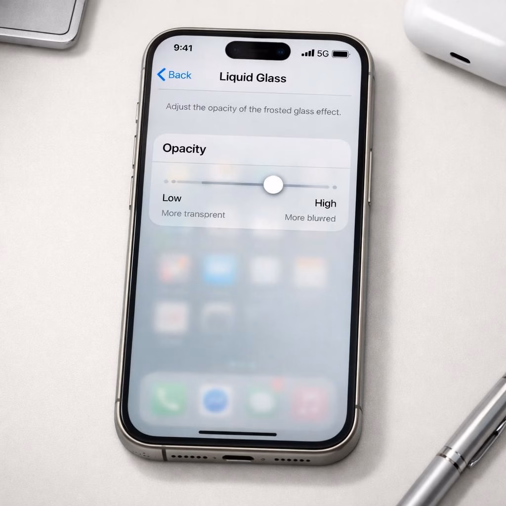
The Liquid Glass opacity slider finally makes sense of the glassy design. I used to think the Liquid Glass revival started with iOS 26 was cute but not essential, yet Tag B turns the dial. The new slider lets you slide between a fully glassy, almost frosted look and a more readable, opaque layer. You can peek at what lies beneath the bar, search field, or tab row, or opt for stronger contrast. The effect is subtle but practical, and it changes how you perceive depth on the screen. Liquid Glass now serves as a readable control surface rather than just a visual flourish, and that shift matters for busy work moments.
Iconography got a gentle refresh. Apple didn’t rebuild the icons from scratch; instead, they refined shading, added a touch more glass, and nudged the color balance to look crisper on both bright and dim environments. The result is a UI that feels slightly more premium and cohesive across apps. If you skimmed the previous year’s icons, you’ll notice the continuity with iOS 26 is there, but the new polish gives everything a sharper edge and a more confident silhouette. The updated icons fit well with the Liquid Glass vibe without becoming gimmicky.
One of the best quality-of-life improvements is independent volume control. In Settings > Sounds & Haptics, you can now set independent volumes for ringtones, alarms, timers, alerts, and system sounds. You can dial in a level for alarms that won’t be drowned by your favorite track, while keeping audio cues audible for notifications. The changes are small but meaningful, and they instantly reduce the kind of mid-session fiddling that would have you reaching for a separate sound profile switch mid-work.
Extra-large widgets are a surprising convenience for those who actually use widgets. They swallow a big chunk of screen real estate, leaving the dock visible, which is exactly what some users want for a quick glance at calendars or to-dos. I’m not usually a widget person, but seeing these as a practical, not gimmicky addition makes the feature more appealing. They’re not a replacement for all your home screen planning, but when you need a massive overview, they deliver, and they do so with the same tasteful, glassy polish that characterizes the rest of iOS 27.
Liquid Glass and iOS 27: Polished UI refinements
You can still tune the Lock Screen for a calmer morning or a sharper evening. The time block can sit next to the date at the very top, which frees up real estate for wallpapers, photos, or a clean, minimal aesthetic. The result is a Lock Screen that looks less crowded and more intentional. It’s the kind of tweak that doesn’t shout for attention but quietly improves the entire experience every time you wake the phone. The combination of Liquid Glass visuals and iOS 27 polish makes these moments of wakefulness feel smoother and more deliberate.
The Lock Screen change is not alone in making navigation feel easier; the entire interface benefits from better typography, more consistent shadows, and a sense that each interaction has a purpose. Tag B keeps refining little details that you might have missed on first glance, from the rail of quick actions to the way widgets align with the edges of the screen. It’s not about reinventing the wheel; it’s about shaving the edges so the wheel spins with less friction. That frictionless feel is the essence of what makes Liquid Glass and iOS 27 feel cohesive together.
Liquid Glass and iOS 27: Widgets, Icons, and Lock Screen gains
As the beta iteration continues, the two big anchors, Liquid Glass and iOS 27, keep pulling in the same direction: improve usability without losing personality. Even when Siri AI remains on the waitlist, these refinements stand on their own as compelling reasons to upgrade. The icons look more confident, the opacity slider offers tangible control, and the screen layout—especially the Lock Screen—feels more generous with space. If you’re someone who spends a lot of time in apps, the combined effect is a calmer, more predictable workflow that respects your eyes and your time.
In practice, the extra-large widgets become a practical way to glance at important data—calendar events, reminders, or weather—without hunting through multiple screens. The updated icons provide instant recognition, and the refined Glass look helps reduce glare while preserving color and depth. The independence of volume settings reduces disruption in meetings or while listening to a video, which is another small but meaningful upgrade that adds up across the day. And yes, Tag B still looks cool enough to show friends during a quick demo, but it feels more like a purposeful design language than a cosmetic choice.
Looking ahead, I expect more AI-enabled features to appear later in 2026, but the current iOS 27 snapshot proves you can ship a polished product without relying on an AI novelty. The Liquid Glass slider, the icon refresh, independent volume controls, extra-large widgets, and a more open Lock Screen collectively elevate the day-to-day experience. It’s a refined package that respects existing workflows while inviting a bit of playful personalization—exactly the kind of balance Apple has built its reputation on over the years.
As I continue to explore over the next few days, I’ll keep sharing impressions. If you’re curious about future features or want a guided tour of settings that finally click, stay tuned. And if you’ve already tested Tag B on a compatible device, tell us which tweaks you love most about Liquid Glass and the broader iOS 27 package.
Bottom line: the update is a confident, calming step forward. The Liquid Glass opacity slider, the refreshed app icons, independent volume controls, extra-large widgets, and the more spacious Lock Screen all add up to a much nicer daily driver. And if you’re excited about Siri AI, you’re not alone—just be patient as the waitlist unfolds, because good things arrive to those who wait.
Share your thoughts below and tell us what you’d like to see in iOS 27 in 2026. Your feedback shapes future improvements!
Source: Special thanks to The Verge for the original coverage and material. The Verge.