

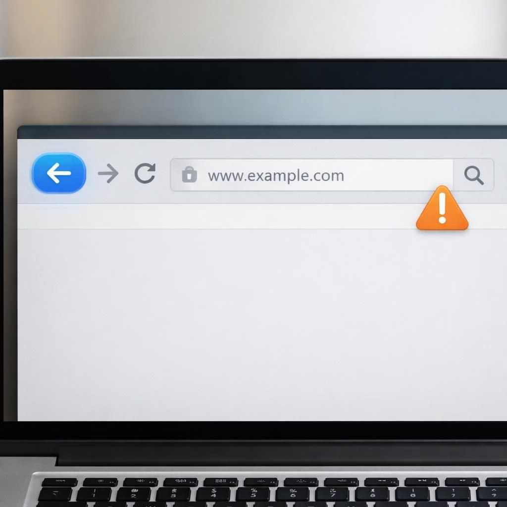
If you’re a site owner, you know that back button hijacking is more annoying than a pop-up on a rainy afternoon. Google has made its stance clear for 2026, and yes, this is about keeping users in control rather than trapping them. This piece breaks down what back button hijacking is, why Google cares, and how to design experiences that respect users while staying on the right side of policy.
Google’s stance on back button hijacking in 2026
Google is steering UX toward clarity. It wants pages that honor user intent and don’t abuse the browser’s back button. The policy targets only the loud, deceptive tricks that force a sequence of pages or hide pages behind fake navigation. For honest UX work, this is a nudge, not a prison sentence. In practical terms, sites that rely on back button hijacking risk frictions in indexing, reduced crawl efficiency, or warnings in the search results. The good news: you can adapt. The goal is to keep people in control, not to punish curiosity or exploration.
Behind the scenes, this stance aligns with Google’s broader push for transparent signals. When a user returns to a page via the back button, the experience should feel natural, immediate, and trustworthy. If a site traps users in a loop or misleads them about where they are in the site, Google has tools to identify and devalue that behavior. The intent is to create a healthier ecosystem where legitimate content earns visibility and questionable tactics lose traction.
Practical fixes to avoid back button hijacking issues with Google policies
- Clarify navigation: ensure the back button behaves as users expect, returning them to the previous content without surprises.
- Avoid forced sequences that enable back button hijacking: don’t require users to pass through pages they did not intend to visit just to reach content they seek.
- Provide exit options: offer clear, opt-in paths when you present interstitials or modal flows instead of hiding content behind forced steps.
- Label pages honestly: title tags, meta descriptions, and in-page headings should reflect the actual content, not a trick.
- Test UX with real users: use simple usability tests to verify that back-button behavior matches user expectations.
- Monitor performance: track bounce rate and time-to-content after changes to ensure you haven’t created friction that hurts engagement.
Beyond these fixes, the broader lesson is that trust matters. Google’s policies reward sites that respect user agency. A seamless back-button experience reduces confusion, boosts accessibility, and often improves SEO. When users feel they control their journey, they’re more likely to stay, explore further, and convert. The criteria are simple: clarity, consistency, and respect for the user’s intent. If you can deliver those, you’ll be aligned with today’s search ecosystem and tomorrow’s expectations.
From a developer perspective, this is a collaborative challenge. It isn’t about locking down creative storytelling, but about designing experiences that honor the browser’s native behaviors. If you’re building a modern site, you’ll want robust routing, accessible modals, and predictable navigation that doesn’t trap users in clever, but unsavory, traps. The best practice is to design with empathy: assume the user will press back, and make that action as painless as possible.
In the end, the user should feel that leaving a page is simple, quick, and entirely voluntary. That’s the heart of Google’s 2026 approach: a friendly nudge toward better UX, not a hostile takedown of bold ideas. Developers who adapt will gain better crawlability, clearer signals for ranking, and happier visitors who are less likely to abandon content mid-read.
If you’re curious how this plays out in real sites, you can look to a handful of changes that began quietly: streamlined exits from modal prompts, transparent interstitials, and content that reveals itself without deception. The trend is toward honesty in UX, with the search algorithms quietly cheering when users feel confident and in control.
We’ll wrap this up with a practical tip: audit your pages for back button scenarios. Do a quick pass: can a user reach content without encountering an unexpected hurdle? If the answer is yes, you’re likely in good shape. If not, time to adjust. The move toward better UX in 2026 is more than policy; it’s a promise that good design and good search ranking go hand in hand.
Special thanks go to the original article that sparked this discussion. Original material from Ars Technica provided the starting point for this breakdown. You can read the source here: Ars Technica — Google will begin punishing sites for back button hijacking in June. Thank you for the thoughtful reporting.
We invite readers to share their thoughts in the comments below, and to join the conversation with ideas, experiences, and constructive feedback. Your perspective helps everyone learn how to design better, kinder web experiences.
What this means for developers and editors
This is a collaborative challenge that invites better practice. It’s not a ban on creativity; it’s a call for transparent UX decisions that respect the browser’s natural behavior. Start with accessible navigation, then grow with empathy for users who just want to read, learn, and browse without surprise.
Read, reflect, and test. If Google’s 2026 policy push nudges you toward stronger UX, that’s a win for users, crawlers, and publishers alike.
Practical audit steps for 2026 UX
- Map typical user journeys and note where the back button could surprise users.
- Audit modals and interstitials: ensure they are easy to exit and don’t block content.
- Run lightweight usability tests with real visitors and collect feedback on back-button behavior.
FAQ
- What is back button hijacking? It’s any technique that manipulates the browser’s Back button to push users through a crafted sequence or hide content.
- Will this impact my site’s SEO? Clear, honest UX that respects user intent tends to improve engagement signals and crawl behavior.
- How can I fix back-button issues? Use predictable routing, accessible modals, and provide a straightforward exit from prompts.
- Is it okay to use interstitials? Interstitials should be content-led, clearly opt-in, and not used to trap users or mislead them about where they are.
Conclusion
The 2026 focus is simple: respect the user’s journey. By designing for clarity and consent, you improve usability and align with how Google evaluates pages. Start with empathy, test with real users, and iterate for better crawlability and visitor satisfaction.
References
- Ars Technica — Google will begin punishing sites for back button hijacking in June
- Engadget — Google addresses back button hijacking in search
- Search Engine Journal — New Google spam policy targets back button hijacking
External sources: DuckDuckGo vs. Google: The Search Engine Choice, Google: Don’t make “bite-sized” content for LLMs if you care about search rank, Google: AI in Search is driving more queries and higher quality clicks.
Image prompt and attribution: see image.json below for the image prompt and file name, and read on for the closing attribution.