

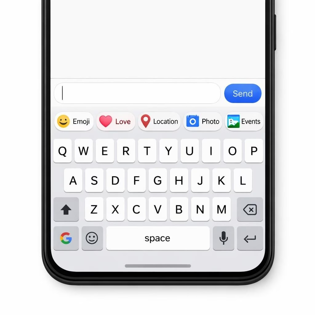
When tech UX turns into a soap opera, keyboards take center stage. The latest act centers on Gboard and Material 3, as the expressive redesign of shortcuts expands beyond testing and into everyday typing. If you thought your keyboard was just a tool, think again: it now aspires to be a tiny stage for every emoji, suggestion, and tap you might want in a single glance. The 2026 rollout is broader, and yes, it comes with caveats about battery life, memory, and the occasional misfiring ghost stroke.
The makeover brings more expressive shortcuts to the Gboard surface, powered by Material 3 color systems and motion language. Shortcuts no longer live in a dull corner of the keyboard; they glow, hint, and gently nudge you toward your next action. Developers argued that a more expressive set of shortcuts can reduce friction, especially on devices with tiny screens or limited thumbs. The net effect is that Google aims to help you finish messages, searches, and notes faster without sacrificing readability or privacy.
Gboard and Material 3: Expressive Shortcuts Reach More Devices
With the rollout, more Android devices and some iOS bridges seem to get the same shortcut language. The Material 3‘s design language defines the visuals: softer shadows, vibrant but accessible colors, and motion that feels purposeful rather than decorative. Expect expanded emoji quick-access, smarter suggestions, and code-free customization that lets you pin your favorite chats or apps to the top row.
- Animated shortcuts reflect context: you see different icons depending on the app.
- Color cues help users tell at a glance where to tap next.
- Voice-to-text and gesture typing remain robust companions to the shortcuts.
For developers, the shift means designing shortcuts that stay readable at small sizes and accessible for keyboard users. Material 3‘s typographic scale helps maintain legibility, even when shortcuts shrink to fit a single row. The real trick is balancing expressiveness with clarity: too much flair can blur the meaning of a shortcut, so the UI team opted for crisp icons, legible labels, and consistent hit targets.
What This Means for Users: UX, Accessibility, and Privacy on Gboard Material 3
Beyond speed and style, accessibility concerns receive due attention. The redesigned Material 3 shortcuts come with larger touch targets, higher contrast options, and clearer typography. People with motor impairments or visual differences should find the changes welcome rather than frustrating. Privacy advocates will want to know that on-device processing remains a priority for suggestions and shortcut decisions, with data minimization at the core of the design. The Material 3 collaboration aims to maintain a trusted experience while delivering more expressive shortcuts that do not overstep user consent.
- On-device personalization reduces cloud data transfer when possible.
- Clear labels and accessible icons support readability for all users.
- Consistent hit targets help prevent accidental taps and typos.
From a product perspective, this refresh aligns with a broader trend toward context-aware keyboards. Shortcuts no longer feel like an afterthought; they become a primary interface layer that respects your time and your thumb health. The design direction suggests that future updates will iterate on micro-interactions, ensuring each tap feels meaningful rather than ornamental.
Tips for Users: Getting the Most from Gboard Shortcuts in Material 3
To make the most of the Material 3 expressive shortcuts on Gboard, start with the basics. Enable the feature in Settings if it appears, then customize the top row with your most frequent actions: chats, searches, quick replies, and voice input. Experiment with color themes that boost contrast for your eyes and environment. If you share devices, consider profiles that keep shortcuts aligned with each user. Remember that updates may shift the exact layout, so check settings after major OS updates to stay in sync. The key idea: make shortcuts serve your workflows, not the other way around.
Beyond personal tweaks, consider how the new shortcuts could affect your multitasking. A well-tuned set can reduce context-switch costs—you switch from messaging to note-taking with fewer hops. If you manage a team or clinic, the same logic applies to workflows and quick templates. The goal is to keep you in flow, not to lure you into a universe of dazzling icons that teach you to tap blindly.
In the Material 3 expressive shortcuts rollout is more than a cosmetic upgrade. It signals a shift toward a keyboard that talks less and does more—faster, friendlier, and more mindful of accessibility and privacy. If you love speed with personality, you’ll appreciate the balance between expressive design and practical function. And if you’re curious to see how this evolves, try the new shortcuts and share your thoughts in the comments below.
Original article credit: Thanks to 9to5Google for the original reporting on Gboard Material 3 expressive redesign of shortcuts rolling out.
Original article credit acknowledged above. For the full details, see the original report in the References section below.