

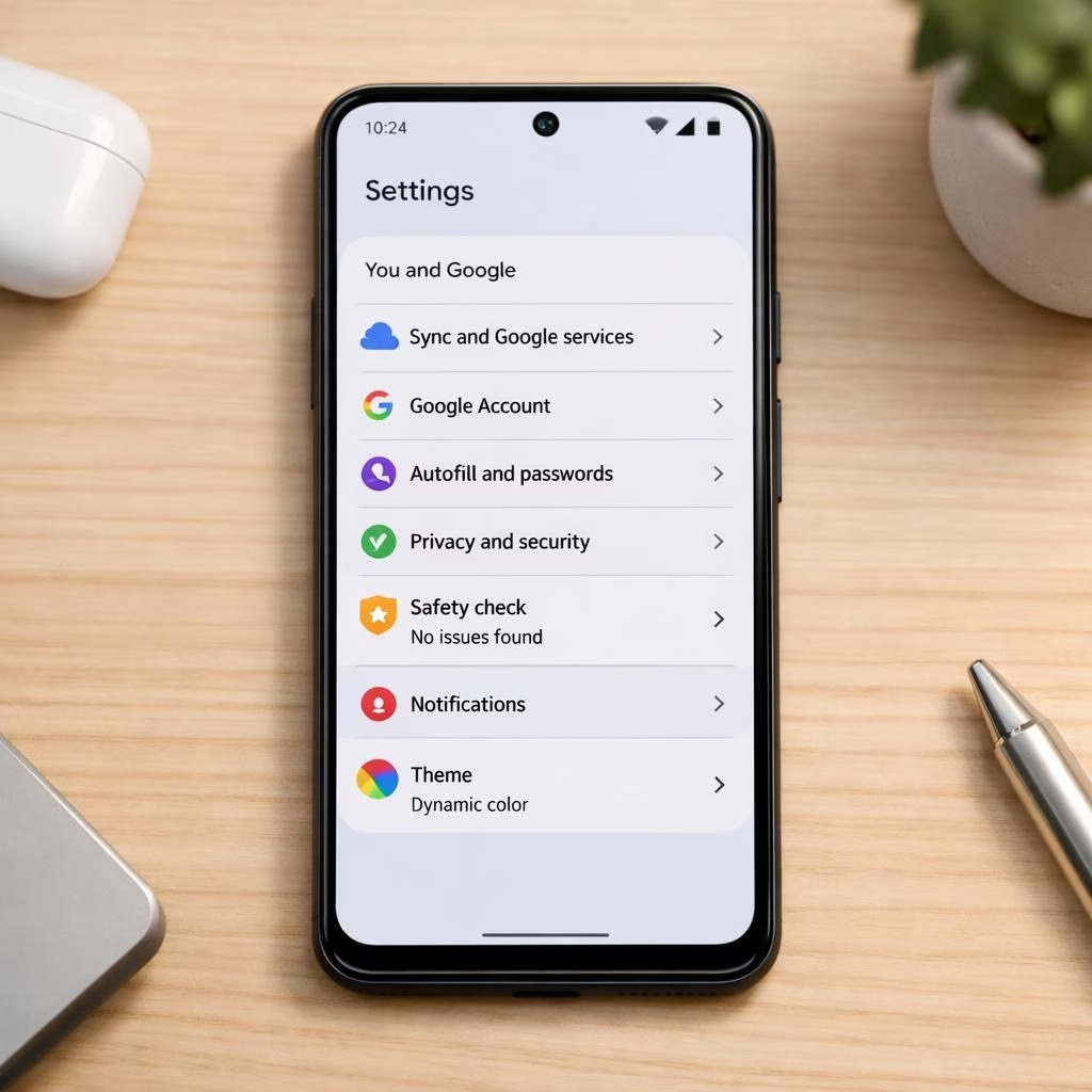
Chrome for Android now embraces Material 3 Expressive Settings, blending fast browsing with expressive design choices for every swipe and tap. The upgrade feels like a friendly nudge from the OS to tune the mood of apps without becoming a designer in a weekend, and it arrives in 2026 with a confident shrug and a few snappy UI moods. This isn’t a forced re-skin; it’s a toolkit that respects the app as a living space, not a theatre prop.
Chrome: Material 3 Expressive Settings reshape Android UX
In practical terms, Chrome’s Android UI can be themed with the Material 3 Expressive Settings panel. Users can pick color schemes, adjust surface shapes, tweak elevation, and fine tune typography. The result is a browser that looks more in sync with your overall device theme while still keeping the performance you expect from Chrome. The settings are not a full OS skin, but a thoughtful layer that respects contrast, accessibility, and readability. This matters because subtle differences in typography and color can reduce eye strain during long browsing sessions and improve focus during late-night reading. The team designs for slow connections and bright screens alike, making the experience feel cohesive rather than chaotic.
Material 3 Expressive Settings explained for Chrome on Android
What’s new is less about radical redesign and more about expressive nuance. The Material 3 Expressive Settings give you a palette: primary and secondary colors, dynamic surfaces, and motion options that lean into delightful micro-interactions rather than flashy showmanship. Chrome keeps speed intact, so these changes feel responsive, not sleepy. For developers, this is a nudge to align Chrome’s UI with Material You principles, creating a more cohesive ecosystem across apps and web content. It also raises the bar for accessibility when users can tailor type scale and contrast without sacrificing layout fidelity. In practice, you’ll notice smoother transitions and more readable menus on both phones and tablets.
- Color theming: pick vibrant or muted palettes, with automatic contrast checks.
- Shape and elevation: roundness and shadow depth to emphasize elements.
- Typography: adjustable font sizes, line height, and clarity for legibility.
- Motion: reduced motion options for sensitive users without breaking transitions.
- Consistency: better alignment with Material You across your Android experience.
- Performance: design choices that stay smooth on mid-range devices.
How to get there? Open Chrome, go to Settings > Appearance > Material 3 Expressive Settings and preview live changes. From there you can back out if something feels off. The goal is less about gimmicks and more about a personalized browsing vibe that respects accessibility and consistency across apps. The team seems to have listened to both designers and power users who crave polish without bloat, and the result is a tasteful upgrade rather than a flashy detour.
There are caveats, of course. Some theme combinations may reduce readability in certain lighting conditions, and certain older themes might clash with newer typography. The recommended approach is to start with a baseline theme, enable a few Material 3 Expressive Settings tweaks, test in different lighting, and then dial back any setting that hurts clarity. In practice, most users will appreciate a calmer, more cohesive chrome that still performs like a rocket.
As with any evolution, y’all have opinions. If you experiment with Material 3 Expressive Settings in Chrome for Android, share what worked for you. Do you prefer bold color accents, subtle surfaces, or a version that mirrors your system theme? Your feedback helps shape how browsers look by default, not just how they boot.
Practical notes for mindful adopters: keep a backup of your favorite baseline and remember that not every app needs a mood ring. Some sites read better with higher contrast, while others glow with gentle pastels. When in doubt, switch to a conservative palette and test across light and dark modes. The point is to empower users to tailor rather than dictate, allowing Chrome to feel both familiar and fresh.
Real-world impact on daily use
In daily practice, the feature translates to a more coherent feel across Android apps. You’ll notice color accents that gently highlight actions in menus and dialogs, sans the garish neon explosions you might fear. The surface shapes and shadows provide depth cues that help you scan pages faster, especially on small screens. For power users who spend hours in the browser, the typography adjustments improve reading clarity, and the motion options help those sensitive to animation. The net effect is a more personalized, less jarring experience that still respects performance constraints on mid-range devices.
Designers and developers may appreciate the philosophy behind Material 3 Expressive Settings: give users control, keep the interface legible, and preserve the speed Chrome is known for. The settings encourage consistency with Android’s material ecosystem while letting Chrome carve its own tasteful niche within it. The outcome is a browser that feels less like a rectangle on a screen and more like a customizable workspace.
Takeaway: If you’re curious about how these tweaks change the look and feel of your daily browsing, try them out and report back. Chrome and Material 3 Expressive Settings can make a measurable difference in comfort and readability over long sessions. The opportunity to personalize your browser without sacrificing performance is worth a minute of exploration in your next Android session.
Original article: Chrome for Android gets Material 3 Expressive Settings — 9to5Google
Thanks to 9to5Google for the original coverage that sparked this look at Chrome’s Android updates. We’re grateful for their detailed write-up and timely sharing of this feature.
References
- Material Design – Material Design guidelines
- Android Developers – Theme and style
- Original article: Chrome for Android gets Material 3 Expressive Settings