

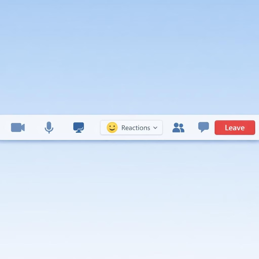
If you’ve ever interrupted a Teams meeting with the Raise Hand button or wondered why your emoji Reactions vanished into the void, you’re not alone. Microsoft’s redesign moves the two controls into a calmer, more customizable toolbar that should feel kinder to the thumb and less dramatic for the host. The update is pitched as a practical reorganization rather than a flashy facelift, and that tone already earns a small, confident nod from daily users.
The update was announced on the Microsoft 365 Roadmap and is expected to roll out sometime in June this year, with 2026 as the landing year for most organizations. In plain terms, teams that live in back-to-back calls will likely notice a smoother, more predictable layout as the calendar ticks toward summer. By grouping the Reactions under a unified controls surface, Microsoft aims to reduce accidental taps and keep conversations on track.
Why does this small shift matter? Because mis-clicks are not merely comic bloopers. They break cadence, derail meetings, and force awkward verbal apologies. By integrating the Reactions, the interface nudges users toward intentional signals rather than reactive taps. The idea is not to erase the emotions we express in meetings, but to make the intent clearer and the moment less noisy. In the new model, you still have access to emoji Reactions, but the path to indicate intent becomes more deliberate and less prone to a thumb-slip.
Raise Hand and Reactions: a smarter Teams toolbar redesign
In the redesigned meeting toolbar, Raise Hand is presented in a more cohesive space with Reactions. The result is a cleaner, faster experience where you can signal a request to speak or drop a quick emoji without hunting down the right icon. The grouping aims to reduce mis-clicks, so your hand-raise moment won’t be mistaken for a string of happy faces or a blinking Reactions that sends a message you didn’t intend. The change also simplifies the overall feel of the toolbar, making it easier to scan and click under pressure.
Microsoft has not released a gallery of screenshots yet, but the company emphasizes that the redesign is built to be faster and easier to use, even if it may feel different at first. In practice, you will notice a more compact arrangement, with essential actions kept front and center and less-used options tucked slightly to the side. The goal is a more intuitive flow that respects the calendar’s rhythm rather than forcing users to relearn muscle memory in a single afternoon.
Raise Hand, Reactions: fewer mis-clicks, clearer Leave button
Beyond the core signals, the update also brings attention to the Leave button. It will be clearly separated on the right, which should help prevent accidental call endings or frantic scrambles to find how to close a meeting. The separation gives a calmer exit path, especially important in long sessions or when multitasking on other projects. The change is not only about aesthetics; it’s about reducing stress during moments that should be straightforward—logging off and heading into the next task with dignity.
Customizations extend to pinning, unpinning, and reordering controls on the meeting toolbar. This means teams can tailor their meeting experience to their workflows. If your team relies on quick Raise Hand signaling and a quick Reactions cue, you can pin those controls in a predictable place. If you rarely use certain icons, you can unpin them or move them out of the way. In short, the toolbar becomes a practical, user-driven surface rather than a one-size-fits-all cluster of icons. The emphasis on customization aligns with a broader trend in collaboration tools: give people control, and they tend to participate more confidently.
In terms of accessibility and usability, the design aims to streamline keyboard navigation and reduce cognitive load. The reorganized toolbar should be easier to scan during a tense moment when a single click can change the meeting’s direction. The early messaging from Microsoft suggests that the update is thoughtful and measured, not a dramatic upheaval. If you’ve ever felt a pang of confusion when toggling between Raise Hand and Reactions, you can expect a gentler, more predictable pattern of behavior in the new layout.
Of course, any change invites a mix of enthusiastic adoption and initial adjustment. For power users who memorize exact icon positions, the transition may require a brief ramp, but the promise is a quicker path to the right action with fewer mistakes. The underlying aim is a more humane interface that respects the tempo of human speech and the tempo of meetings themselves. Raise Hand remains a tool for signal; Reactions remains a tool for emotion. The two now live in a more harmonious neighborhood, which is a small victory for anyone who enjoys a calm digital desk.
As with many software refinements, you may experience a learning curve. The design team has suggested the change will roll out gradually through June this year, allowing organizations to adapt at their own pace. The practical takeaway is simple: expect a cleaner toolbar, a more deliberate signaling system, and a clearer exit route when meetings end. The rest is about how you choose to write your next virtual up-to-speed moment, using Raise Hand and Reactions with a bit more confidence and a touch less drama.
Original source: Thanks to The Verge for coverage of this update. Original source: The Verge.
If you have thoughts about the redesigned toolbar, feel free to share them below. What works for you in the Raise Hand and Reactions reorganization? How will you set up your own pinned controls? Would you appreciate faster, cleaner exits from meetings? Share your thoughts in the comments and let’s compare experiences with the new layout.
FAQ about the Raise Hand and Reactions redesign
-
When is the rollout scheduled?
The update is rolling out gradually through June 2026, with broad availability by mid-year.
-
Will I need to relearn the interface?
Microsoft says the changes are designed to be faster and easier to use, though there may be a brief adjustment period.
-
Can I customize the toolbar now?
Yes. You’ll be able to pin, unpin, and reorder controls to fit your team’s workflow.
-
Where can I find more official information?
See the Microsoft 365 Roadmap and Microsoft Learn documentation for Teams.
Takeaway: the redesign prioritizes clarity, reduces mis-clicks, and puts you in control of your workflow. Start by noting how you use Raise Hand and Reactions, then tailor your toolbar for smoother meetings.
References
- The Verge: Microsoft Teams accidental hand-raising fix
- Microsoft 365 Roadmap
- Microsoft Learn: Microsoft Teams overview