

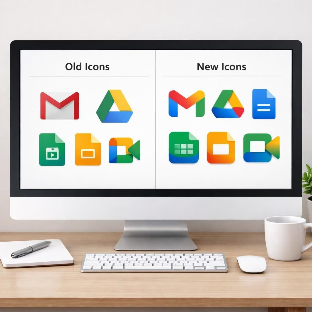
If you’ve ever opened Google Workspace, you’ve probably bumped into the Icon Redesign fairy. Yes, the icons got a gradient makeover, a few landscape tilt tweaks, and a general sense that the whole suite is ready to compete with your desk lamp for the best-lit interface. The result is friendlier, shinier, and perhaps a touch more legible at a glance—exactly the kind of update that makes daily tasks feel suddenly stylish.
Designers lean into gradients to give depth without heavy shadows. The new Icon Redesign shifts some icons from rainbow to single color, so each icon stands out while maintaining a cohesive family look. In the suite, the Icon Redesign brings consistency to the badge set while offering enough personality for quick recognition. The changes feel like a well-placed seasoning: noticeable, but not distracting.
Some apps take a bolder leap than others. Icon Redesign moves Google Chat, Meet, and Calendar toward a cleaner, single-color approach, which helps individual icons pop against a crowded toolbar. It’s a practical choice: simpler icons are easier to scan on small screens and in quick glance contexts. Yet the shift isn’t a total identity reboot; the underlying shapes and syllables of each app remain familiar, so you won’t have to relearn where your messages live just because the color got friendlier. The Icon Redesign still respects the long-standing visual language, but it adds a touch of modern polish that makes daily navigation feel a little smoother.
Docs, Sheets, and Slides keep their color stories largely intact, but there are still meaningful tweaks. Reports note that those three icons retain their general hue families, yet Icon Redesign now sometimes present their icons in a broader, more landscape-oriented orientation, reflecting the way most people actually use the apps. The landscape tilt isn’t a gimmick; it’s a practical nod to real-world workflows where horizontal layouts oftentimes read better on wider screens and tablets. In the world of Google Workspace, the Icon Redesign acknowledges usage patterns without turning the whole suite into a radical departure.
The Icon Redesign stands out for Drive with rounded corners (and it lost the red corner). A few also shed borders, as with Keep, which is now a yellow light bulb on a clean field. It’s the kind of change that makes you smile when you spot the bulb in your app grid again after a long scroll through a spreadsheet—small, deliberate, and pleasing to the eye.
Gmail gets a quieter polish, delivering a cleaner, more legible mark that still feels unmistakably Gmail. The refinement is subtle enough that current users won’t need a cheat sheet, but noticeable enough to convey that Google Workspace is investing in clarity. The timing of these updates is no accident: the Icon Redesign lands just ahead of Google I/O, where the company sometimes rolls out broader ecosystem shifts. The result is a preview of potential future improvements that could ripple through fonts, icons, and other visual cues across the entire Google Workspace ecosystem.
Google Workspace Icon Redesign: The Gradient Glow and Layout Shifts
Reading the room, the Icon Redesign glow helps the design read as energetic without shouting. Gradients offer depth and a sense of tangible surfaces, which makes icons feel a touch more tactile on glassy surfaces. This is not about chasing novelty; it’s about enhancing quick recognition in busy dashboards. In Google Workspace, the color story evolves from an all-hands rainbow into a cohesive, scalable family where each app still has its moment in the spotlight, but with calmer, more legible edges. This kind of refinement benefits power users who bounce between Google Chat, Google Meet, and Calendar, ensuring they can locate tools in seconds rather than moments.
For designers and product teams, the Icon Redesign reveals a practical philosophy: keep the iconic shapes, modernize the finishing touches, and honor usage patterns. The transition to a more landscape-friendly stance for Docs, Sheets, and Slides aligns with common workflows—especially on laptops and tablets. It’s not a revolution; it’s a pragmatic upgrade that makes sense for people who rely on these tools every day. The gradient treatment, border removal in some icons, and rounded corners on Drive all contribute to a fresher, more cohesive visual ecosystem with less cognitive load during navigation.
Google Workspace Icon Redesign: What It Means for Productivity and Recognition
From a productivity perspective, the Icon Redesign is about speed and calm. Users scan a grid of apps, pick the right tool, and move on. A well-graded gradient can improve contrast on mobile devices, while a single-color approach reduces visual clutter in dense toolbars. In Google Workspace, the icon language enhances recall by keeping core shapes recognizable but improving at-a-glance legibility. It’s a subtle boost, but one that can shave seconds off daily tasks—an incremental win that compounds over weeks and months. The changes also aid accessibility: cleaner shapes and higher-contrast icons help people with low vision identify apps more quickly, which is a meaningful upgrade in a suite professionals rely on for mission-critical work.
Color logic matters, too. The Icon Redesign uses color economy to keep the UI feel balanced across devices. For teams that manage large deployments, a consistent icon language reduces onboarding friction. The user experience becomes smoother when icons don’t fight for attention, letting users focus on content rather than the chrome surrounding it. In Google Workspace, the Icon Redesign is less about chasing trends and more about delivering a practical, scalable design system that stays legible as the suite evolves. It’s a thoughtful upgrade that respects established habits while nudging them toward clearer, faster interactions.
For fans who care about branding, the updates are an interesting exercise in maintaining identity while embracing modernization. The Icon Redesign preserves the familiar silhouettes and letterforms that users recognize from the long arc of Google Workspace usage, while introducing a gradient language and border simplification that signal intent and polish. In practice, this means a more cohesive user experience across Chat, Meet, Calendar, Docs, Sheets, Slides, Drive, Keep, and Gmail. It’s a balanced blend of continuity and progress that should please both long-time users and newcomers who first encounter the suite today.
And yes, the rollout is deliberate. The Icon Redesign appears ahead of Google I/O, inviting attention to a broader conversation about how visuals guide interaction in a sprawling ecosystem. If you’re curious about the roadmap, the changes hint at a broader strategy: a more legible, more accessible, and more cohesive Google Workspace that remains familiar enough to stay comforting. The gradient glow, border shifts, and occasional layout tweaks demonstrate that even the smallest visual cues can translate into calmer, more efficient workdays.
In short, Google Workspace’s Icon Redesign represents a thoughtful, user-first update. It blends gradients with practicality, reshapes a few icons for clarity, and nudges apps into a more consistent, landscape-friendly stance where people actually use them. If you’ve been waiting for a little spark of polish in your daily tools, this is a welcome nudge rather than a shout. The icons feel more human, more legible, and more ready to help you get things done with a smile.
What do you think about the new Google Workspace Icon Redesign? Do the gradients help or distract? Which icon changes are your favorites, and which ones would you tweak? Share your thoughts in the comments below and start the conversation with fellow users. Your insights help shape how these design updates land in daily workflows.
Original reporting and visual coverage can be found via The Verge. Original article reference: The Verge – Google Workspace icon updates and related design notes.
Thanks for reading, and special thanks to the original source material for sparking this thoughtful look at the Google Workspace Icon Redesign. If you enjoyed this breakdown, please consider sharing it with friends and colleagues who care about UI clarity and branding as much as you do.
FAQ
-
What exactly changed with the Icon Redesign?
The updates focus on gradients, border simplification, and a shift toward landscape-friendly layouts for Docs, Sheets, and Slides. See how Icon Redesign influences readability at a glance.
-
Will these icons affect daily workflows?
Yes. The cleaner shapes and higher contrast aim to speed app recognition, especially on smaller screens and busy dashboards.
-
Are the changes accessible to all users?
Cleaner silhouettes and sharper contrast help users with low vision identify apps more quickly, contributing to a smoother daily experience.
-
When is the rollout happening?
The rollout appears ahead of Google I/O, with broader ecosystem tweaks often following later in the year.
References
- The Verge – Google Workspace icon updates and related design notes
- Google Workspace Updates
- Material Design icons guidelines