

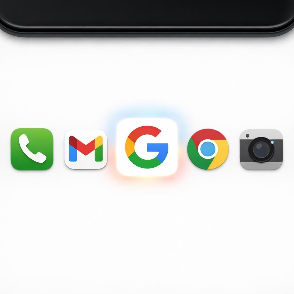
In 2026, Google’s icon refresh is sweeping across apps, turning update fatigue into a small celebration. From a brand perspective, Google Icon updates are not mere polish; they signal a friendlier, more legible aesthetic. This isn’t a hammering change, but a careful redesign that respects the past while embracing color theory. Across product teams, designers cheer a consistent visual language that travels from mobile to desktop with calm confidence. The Gradient Design approach, paired with the Google Icon refresh, promises better recognition in crowded app grids. What many users notice first is brightness with balance, a glow that enhances clarity without shouting for attention.
When you zoom in, Gradient Design becomes a system. It uses a palette of calibrated tones, a handful of corner radii, and a few shadow hints that create depth without drama. The Google Icon refresh keeps a familiar silhouette while giving it more depth, flexibility, and digital polish. The idea is not to reinvent the wheel, but to refresh the wheel so it rolls more smoothly across surfaces, resolutions, and accessibility settings. For teams juggling dozens of icons, this design language offers a predictable, scalable workflow that reduces last-minute patching. The result is a more cohesive ecosystem where apps feel like they belong to one family, rather than a patchwork of odd guests.
Gradient Design: Why it sticks in 2026
So why does Gradient Design stick in the wild world of apps? Because gradients point attention with intent, guiding the eye toward the icon that matters. They add warmth without crowding the screen and help icons pop on both light and dark themes. In practice, Gradient Design assets need to be crisp at small sizes, and they must survive the tyranny of motion across transitions. For developers, that means scalable SVGs, well-defined color tokens, and guardrails around glow and contrast. The Google Icon remains instantly identifiable even when scaled down, which keeps users from squinting and guessing. The approach also encourages a calmer brand rhythm, where colors have relationships rather than random spring color bursts.
Google Icon evolution: practical takeaways for apps
For teams implementing the Google Icon evolution, the work is as much about process as pixels. Create a shared icon kit that carries the same proportions, padding, and alignment rules across platforms. Test on real devices, not just mockups, to ensure legibility in tiny app grids. Ensure high contrast variants exist for accessibility, so users with low vision still find the icon unmistakable. Use consistent animation timing so the Google Icon feels intentional, not jittery. And keep the Gradient Design elements coherent: the same gradient family, controlled light, and predictable reactions to background colors. By treating the Gradient Design and the Google Icon as part of a design system, teams reduce drift and improve long-term maintainability.
- The Gradient Design approach helps users recognize the brand quickly among other icons in a grid.
- Respect for accessibility means ensuring sufficient contrast and clear shapes in all sizes.
- Asset management becomes easier when icon kits are centralized and versioned consistently.
In user stories and UI critiques, the combined effect of Gradient Design and Google Icon is a more trustworthy interface. Icons feel intentional, not accidental, and users experience less cognitive load when scanning screens full of apps. The gradient accents can act like friendly punctuation marks, highlighting the brand without shouting. And the glow is real, but it’s calibrated to feel helpful rather than flashy.
In sum, this design refresh is a gentle nudge toward a future where brand identity travels lightly across devices while staying unmistakably Google. The graders of aesthetics can applaud: the color tokens respect both legibility and personality; the shapes remain recognizable; and the whole system is easier to maintain as screens proliferate. For engineers and product managers, the shift offers a more predictable path to update cycles, a clearer style guide, and fewer last-minute design detours. For users, the result is a more cohesive and welcoming experience without sacrificing speed or functionality.
If you enjoy this kind of design conversation, please share your thoughts in the comments below. How does Gradient Design influence your perception of the Google Icon on your devices, and what do you notice first when icons glow with intent in 2026?
External sources
References
FAQ
- What is Gradient Design? A color strategy using gradients to add depth and hierarchy to icons, while staying legible.
- What is the Google Icon refresh? A redesign that keeps the silhouette but adds depth, scale, and polish for better recognition across surfaces.
- Will this affect accessibility? Yes. The rollout emphasizes contrast, legibility, and motion that respects users with low vision.
- How should teams implement it? Create a shared icon kit, test on real devices, and keep a consistent gradient family.
Takeaway: The Gradient Design and Google Icon rollout aims for consistency, accessibility, and maintainability. Start small, align your design system, and plan gradual updates.