

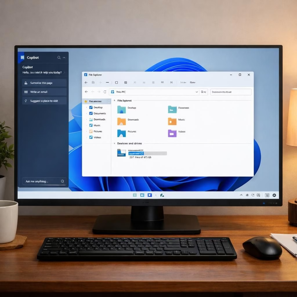
In 2026, Copilot on Windows 11 keeps hinting it wants a corner office, but the design team nudges it toward the edge of the desktop. The latest update docks Copilot to the screen edge rather than floating as a separate window, offering a playful yet practical twist. The core idea remains: AI lives with your apps, not in a separate universe. And yes, it’s getting nudged and snapped into place with a familiarity that Windows users will recognize from Snap Layouts, while still leaving room for a little experimentation.
Copilot docking on Windows 11: a smarter edge
By default, Copilot opens as an app, but hover over the new drop-down in the title bar and you’ll find snapping options. You can dock Copilot to the left, to the right, or keep it in a small, top-on-screen window that stays above your files—very much in the spirit of a modern picture-in-picture. This is a courtesy to productivity, letting you keep your primary work surface clear while still having AI assistance at a glance. The design aligns with the Windows 11 philosophy of flexible layouts, which means your desktop watermarks and app icons gracefully shuffle to accommodate your AI helper.
From a technical standpoint, this is a thoughtful reframe of the original Copilot concept, which was to sit alongside your apps rather than dominate the screen. It’s not about forcing AI into a single pane; it’s about offering options. In the new model, Copilot can be docked to the left or right or kept as a pinned, on-top companion. Microsoft even shows off a version that behaves like picture-in-picture, letting you glance at AI nudges without sacrificing your file explorer or browser tabs. This flexibility is a nod to user autonomy, a rare thing in software where UI decisions often masquerade as inevitability. Microsoft also highlights the value of adaptability in modern desktops.
Historically, Copilot on Windows 11 has undergone several revamps. In 2026, Microsoft seems to embrace a dialed-back, more native feel rather than a floating app with a live side panel. The old startup idea—Copilot as a sidebar—was elegant in intention but clunky in practice. The new docking approach preserves the spirit of that sidebar while weaving it into the OS’s layout grammar. It’s a redesign that acknowledges the inevitable: users need AI when they need it, and sometimes they want it tucked neatly at the edge rather than yelling from the corner of the screen.
There’s a practical twist too: the Edge-based wrapper under the hood. Windows Latest reported that Copilot now ships with its own Edge instance, a curious choice that some see as an efficiency hack, others as a way to ensure the docked experience feels instant. If you’re wary of bundling, consider this: a dedicated Edge container can keep Copilot’s UI snappy while reducing cross-app interruptions. It’s a small detail that matters when you’re juggling documents, code, and calendar invites all at once in Windows 11 2026-era workflows.
So what does this mean for daily use? If you like a minimal, persistent AI presence, dock Copilot to the edge and let the rest of your desktop breathe. If you prefer a more traditional desktop layout, you can still run Copilot as an app, but the option to dock gives you a steadier, more integrated experience. The UI changes are modest, but they tilt the balance toward native feel without sacrificing AI power. It’s a win for people who want a clean workspace and a clever assistant, all within reach on Windows 11 systems from the current year, 2026, onward.
One caveat to watch: moving elements around a live desktop can shift your workspace, which means you might need to adjust window sizes or reposition a few items after a restart. The Snapping feature is not intrusive, but it does demand a moment to remember that Copilot is not a separate window so much as a panel that shares the stage with your apps. The outcome, though, is a more cohesive experience that reduces the friction between AI and human users.
Copilot UI on Windows 11: benefits, quirks, and lessons
From a usability angle, this approach makes Copilot more accessible, especially if you constantly toggle between documents, code editors, and communication apps. The docked UI offers quick glance opportunities, so you can see a response, a glossed summary, or a clever tip without contorting your layout. The left-edge dock and right-edge dock play nice with multiple monitors and DPI scaling, a frequent headache for Windows users. The updated design also hints at a future where AI can anticipate your needs—often before you explicitly ask—without becoming a noisy background app.
Microsoft has reportedly redesigned Copilot several times in Windows 11, and while the count varies by source, the gist is consistent: the company is iterating toward a tighter, more integrated feel. The latest docking approach might be the one that finally makes Copilot feel like a natural extension of the desktop, not an afterthought. In this sense, the 2026 iteration reads as a matured concept rather than a rolling experiment. The goal: AI that’s helpful, visible, but not disruptive.
As a user experience experiment, this UI deserves credit for balance. It presses Copilot into a role that’s useful without being loud, and it respects the OS’s own layout logic. You still get AI-driven insights when you need them, but not at the cost of your focus. If you’re a keyboard aficionado or a window-tweaker, you’ll appreciate the freedom to tuck Copilot into a corner or keep it hovering on top, all while Windows 11 maintains its clean, modern aesthetic. The docked approach also scales across monitors and devices in a way that reminds us: good design is as much about restraint as it is about power.
For teams and IT departments, the update signals a subtle but meaningful shift: AI tools that integrate rather than scream. The docking option reduces the cognitive load of managing AI across dozens of apps, and that matters when you’re juggling code, meetings, and communications on Windows 11 in 2026 or beyond.
Overall, this reborn Copilot UI on Windows 11 reflects a forward-looking compromise: keep the AI accessible, keep the desktop elegant, and keep your workflow in harmony with the operating system’s established patterns. If you enjoy a tidy workspace with power at your fingertips, you’ll likely welcome the edge-docked Copilot and its ability to adapt as your tasks evolve in 2026 and beyond.
Original material courtesy of Windows Latest. A heartfelt thank you for the original reporting and thoughtful exploration of how Copilot evolves on Windows 11.
Have ideas or experiences with the new Copilot UI on Windows 11? Share your thoughts in the comments below!
Practical steps to try the edge-docked Copilot
- Open Copilot as you normally would, then hover the title-bar drop-down to reveal snapping options.
- Choose left, right, or the on-top picture-in-picture mode to see how it fits your workflow.
- Test with a few apps (File Explorer, a code editor, and a browser) to observe how the layout adjusts.
- If something feels off after a restart, re-open the drop-down and re-dock the panel to your preferred edge.
Frequently asked questions
- Q: How do I dock Copilot to the edge?
- A: Hover the Copilot title-bar menu, pick a snapping option (left or right), or choose a small on-top window.
- Q: Will docking affect performance?
- A: The Edge-based wrapper is designed to be snappy, reducing cross-app interruptions while keeping AI at hand.
- Q: Can I revert to the old app-only mode?
- A: Yes—open Copilot and select the standard app mode from the same snapping menu.