

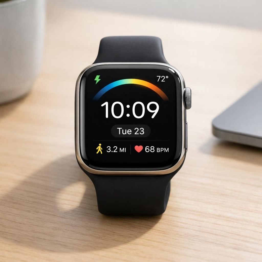
If you’re an Apple Watch owner, you’re buzzing about the upcoming watchOS 26.5 update and the next watch face that might redefine how you glance at the time. The rumor says this face isn’t just a cosmetic tweak; it promises a small productivity boost wrapped in friendly wrist warmth. In plain terms, the Apple Watch will get a face that looks cleaner, feels quicker, and understands that you actually want a glanceable summary, not a mini dashboard for calendar invites. Some fans swear the update will finally let you customize complications without a PhD in iconography. Others tease that the new face might support smarter widgets that surface your most-used data at a mere flick of the wrist. Either way, the promise is simple: fewer taps, more time to pretend you’re fully in control of your life.
Apple Watch and watchOS 26.5: The Next Face
Design-wise, the new face watchOS 26.5 is said to lean into legibility and control. You may see bolder numerals, improved contrast, and a richer set of complications that stay out of your way until you need them. The watch faces of watchOS 26.5 could offer smarter color palettes that adapt to lighting, a subtle nod to how you use your device during dawn and dusk. For developers, this is an invitation to craft tighter widgets and more informative quick-glance panels, rather than dumping every possible metric into a tiny corner.
Personally, the idea is appealing: a face that learns from you. If you check the weather at seven every morning, the forecast might appear where you expect it, without you squinting. If you commute by bike, the face could highlight your fitness rings in a readable way even through morning glare on your sunglasses. Balance remains the key: more data when you want it, but not a screen invasion when you don’t. For Apple Watch wearers, a smarter face could respond to daily routines with fewer taps and more glance-friendly answers in watchOS 26.5.
Color, contrast, and glyphs matter on a tiny screen. The watchOS 26.5 specs reportedly push for high-contrast modes that stay readable in bright sun and dim elevators alike. That means fewer moments of “did I miss something important?” and more moments of “okay, I’ve got this.” The new face design should also feel cohesive with existing faces, so you don’t have to rewire your brain every time you glance at your wrist. It’s a small victory if your face can show you the weather, calendar, and heart rate with a single, confident layout.
Why Apple Watch fans care about watchOS 26.5 faces
For Apple Watch wearers, a smarter face translates to faster access to the stuff you actually use. A cleaner layout reduces the time spent squinting at tiny icons or twisting the crown to find what you need. A tighter, more reliable surface for weather, reminders, and activity data can improve daily rhythm without feeling like clutter. In short, it’s a quiet upgrade that makes the device feel more like a cooperative sidekick than a high-maintenance dashboard.
From a software perspective, watchOS 26.5 would likely push for consistency across faces and lower visual noise. Developers might be asked to implement faster rendering paths and more accessible contrast modes. The result should be a face that loads swiftly, refreshes gracefully, and remains readable even when your wrist is moving. Accessibility-minded users may gain larger tap targets and improved haptics when you switch faces. The ecosystem benefits when developers can deliver reliable widgets that feel native rather than tacked on as afterthoughts.
As with any update, the usefulness shows in daily life. Will you pick a face that saves a few seconds each day, or revert to the familiar, unfussed default? The best outcome is a face that feels natural enough to recall in your sleep, yet clever enough to surprise you with a small, welcome tweak now and then. If it manages to do both, you’ve got a winner for your wrist and your mornings alike.
Practical tips for exploring watchOS 26.5 faces: test a few layouts at different times of day, observe how the color scheme affects readability, and use the crown to swipe through views without breaking your rhythm. Power users can pin their go-to complications in a layout that matches their routine, then switch faces in seconds with a couple of taps. In short, it’s about making the watch work for you, not the other way around.
Finally, a gentle note on expectations. A watch face is not a full dashboard; it’s a refined tool that should reduce friction, not create it. If you’re hoping for a dramatic UI overhaul, you may be pleasantly surprised; if you’re hoping for a radical departure from current design language, you might leave a little disappointed. The truth sits somewhere in between: a smarter, cleaner, more readable face that respects your time and your wrist.
Original article attribution: Thanks to the original article on 9to5Mac via Google News— thank you for the original reporting.
Have thoughts or a personal experience with the upcoming face? Share your insights below. If you’ve tried any of the new layouts, your feedback could help others decide what to enable on their own wrists.
References
- 9to5Mac — Here’s the next Apple Watch face coming in watchOS 26.5
- Apple Watch with watchOS
- WatchKit — developer resources