

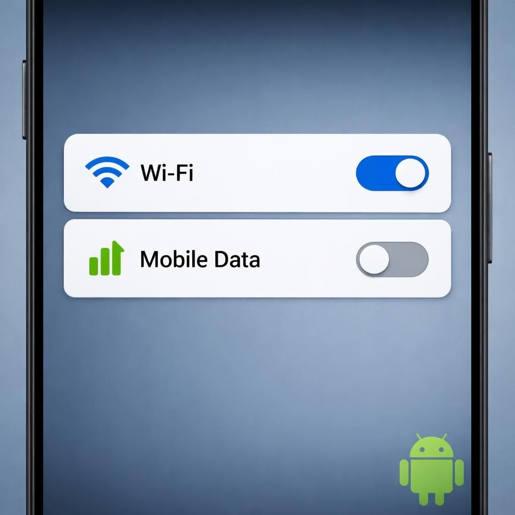
Android fans remember when Google merged WiFi and mobile data into a single Internet tile, promising simplicity but delivering a dashboard that felt more like a tiny Swiss army knife with missing blades. For a moment, the Android status bar hummed with harmony, yet power users soon asked for real control. The good news in 2026 is that Google appears to be listening: Android Canary builds are bringing back independent toggles for WiFi and mobile data, and the result is a cleaner, more predictable Quick Settings experience.
Android and WiFi: Independent Toggles Return in 2026 Canary
The original shift happened with the Android 12 era’s Internet tile, a unification that swept away separate WiFi and mobile data controls. It was billed as a simplification, but it often felt like driving a car with one pedal attached. In the Canary channel, Google is reversing that design decision. The latest Canary Build 2603 introduces separate WiFi and mobile data toggles. The Internet tile is no longer the anchor in Quick Settings, and if you update, the system will swap the old Internet tile for a WiFi toggle on install.
The Android WiFi Split: What It Means for Daily Flow
With two distinct toggles, you can flip WiFi on or off without also accidentally changing how your cellular data behaves. This matters when you’re trying to troubleshoot connectivity mid‑coffee run or when you’re bouncing between a campus network and a personal hotspot. The practical upshot is more predictable behavior: you’re not juggling multiple states at once, and you can quickly verify whether you’re on WiFi or cellular data with a single tap. It’s the kind of small win that makes a big difference in daily Android use.
For those who live in areas with spotty service, the separation helps you manage expectations. Turn off WiFi to force the device onto mobile data and then back again without hunting for the right toggle among a pile of options. The UI nuance matters for a minimal friction experience, and it’s the kind of improvement that power users will notice as they glide between work WiFi, home networks, and public hotspots.
Canary Build 2603 Details: What to Expect
Beyond simply re‑introducing two toggles, this Canary iteration ships with a broader palette of interface changes. The Internet tile disappears as a default control, replaced automatically by the WiFi toggle when you upgrade. In practice, that means fewer steps to manage your network state, and a more intuitive sense of how you’re connected at a glance. The data toggle remains present, but its behavior now aligns with a more explicit state machine—on or off for data, independent of whether WiFi is active. The separation isn’t just cosmetic; it’s a behavioral reset that aligns with how most users actually think about their connections.
Google’s Canary builds are known for nudging the design envelope with both subtle and bold changes. In this release, you’ll also notice changes that ripple through the broader Quick Settings and notification shade. While the Internet tile’s disappearance might feel like a small concession, it’s paired with a more direct routing to network controls. In other words, the Android team seems to be listening to the chorus of feedback from users who prefer direct toggles to a single, all‑encompassing switch.
Two Subtle Shifts: Android Foldables
On foldable devices, separate WiFi and mobile data tiles become particularly useful. The foldable form factor often stretches the Quick Settings panel, and having distinct tiles reduces the need to expand menus or navigate multi‑step paths to reach the same result. It’s a usability enhancement that speaks to a specific concern of real‑world device owners: fewer taps, faster state changes, and a more predictable experience when you’re juggling two networks at once. In that sense, the move isn’t flashy; it’s practical and patient, precisely the kind of tweak that lands well with early adopters and everyday users alike.
More Canary Surprises: UI Flourishes and Small Utilities
Google’s 2026 Canary push isn’t solely about network toggles. It also ships with a surprising number of visual and functional tweaks. For example, some Canary builds unveil a native app lock feature, a welcome addition for folks who want a quick second layer of protection without third‑party apps. There’s also the ability to bubble an app—an option tucked into long‑press menus that makes multi‑tasking feel a little more playful and a little less clanky. When space is at a premium, Google has started tucking extra actions into a Submenu named Shortcuts, which streamlines access to common tasks without crowding the main surface.
As part of the broader UI refresh, you’ll see a dash of extra blur across system UI elements, a design cue that aims to soften transitions and give a more cohesive feel to widgets and the home screen. All of these bits are still part of the Canary channel, which means they might change or migrate before any broad public release. If you’re testing these builds, you’re effectively helping shape what Android looks and feels like in the next major release cycle.
What This Means for Android 17 and the Road Ahead
While this particular feature set is currently in the Canary Channel, there’s talk that Google may or may not carry these changes into the next Android beta or public release. The Android 17 narrative—split the notification shade and Quick Settings panel on foldables, keep or reimage the WiFi and data toggles—highlights a broader strategy: tailor the OS to the realities of diverse devices and contexts. In other words, Android is testing a future where controls are deliberate, discoverable, and less prone to accidental toggling. If this approach sticks, you could see a smoother handoff between work and personal devices, especially on devices with larger screens and more complex network needs.
Practical Tips for Android Early Adopters
- Re-pin the WiFi and data toggles for quick access.
- Explore the Shortcuts submenu to attach actions to long‑press on apps.
- Try app lock and bubble features to multitask more efficiently.
- Use the feedback channel to report inconsistencies or issues you encounter.
In short, the move toward independently accessible WiFi and mobile data toggles reflects a broader trend: Android is leaning toward clarity, speed, and user control. It’s not a radical reboot; it’s a careful reintroduction of a familiar toolset with a more usable, less… mystery‑box feel. If the Canary channel is any guide, the future of Quick Settings could become a model of pragmatic design—friendly to casual users and satisfying to those who like to tinker.
Original article: Thank you to the original article on 9to5Google for the base material.
What do you think about Android bringing back separate WiFi and mobile data toggles? Share your thoughts in the comments and tell us how this affects your daily workflow. And if you found this update helpful, consider sharing it with friends who love clean, direct network controls.
References
- Android Police: Google reverses Android’s most annoying UI changes
- 9to5Google: Android Canary Build 2603 wifi data toggles