

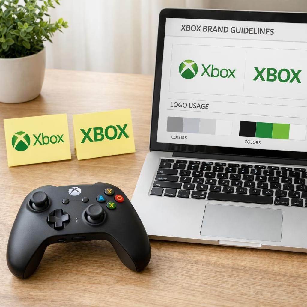
Welcome, readers, to a cheerful, practical look at Xbox and XBOX branding in 2026, where a playful capital shift meets everyday gaming life. We examine why a logo swap becomes a moment of culture, how teams talk about brand assets, and what it teaches us about audience expectations. The topic is not just marketing fluff; it redefines how the company communicates with fans, partners, and newcomers who want a simple, reliable brand to trust.
Xbox Branding in 2026: A Gentle Rebrand Tale
In the past, branding experiments felt like a formal debate with a whiteboard and a timer. Today, the process looks more like a collaborative jam session. The Xbox brand has moved from a single noble console icon to a living system that spans cloud, PC, console, and mobile experiences. The XBOX badge on some surfaces is not a betrayal; it is a signal that the brand embraces context switching—the life of a gamer who toggles between hardware, software, and services. The new look is not a retreat from the past; it is a bridge to the future where simple, legible typography can travel far beyond a living room. The Xbox identity now leans into bold practicality that still carries a wink for fans, especially when a short, sharp headline appears on a splash screen or storefront icon.
Readers have questions about why the capitalization matters. The truth is that branding is a language, and language evolves. When you see XBOX on a panel, you notice the breath of attention across devices and channels; when you see Xbox on a controller, you feel familiarity. The two forms can coexist if used with clear rules: one form for branding on devices, another for marketing pages, another for partner communications. The outcome is not chaos; it is a flexible system that honors the name while adapting to a multiplatform world. There is humor in it, too. The public debate about uppercase versus lowercase feels like a friendly game of name tag at a convention, and the brand ends up richer for the banter.
From a designer’s desk to a marketer’s calendar, the change invites a practical approach. The team develops a compact set of usage guidelines, a few universal color tokens, and a small library of icons that travel well across screen sizes. The result is a branding system that feels modern yet grounded. Designers can reuse typography tokens in marketing, product pages, and help content, while developers wield CSS variables to keep typography legible at tiny mobile sizes and bold on big displays. The public conversation is not a distraction; it is a form of feedback that helps fine-tune the balance between tradition and progress. In other words, Xbox and XBOX become two elements of one resilient identity, not a conflict but a duet that can sing across devices and continents.
Two core ideas stand out for teams considering a similar path. First, anchor the brand in a single source of truth: a living brand book that spells out when to prefer Xbox and when to use XBOX, and how the marks appear next to art, copy, or product. Second, test across contexts: console dashboards, storefronts, and help pages, then adjust with data rather than anecdotes. When you approach branding as a system rather than a slogan, you build confidence inside the company and legitimacy outside it. The outcome is a clear, confident brand voice that remains flexible enough to evolve as technology, markets, and communities shift. And yes, there is room for a little humor—the best brands make room for play while staying reliable when it matters most.
Consider the audience now: casual gamers, hardcore fans, families, and developers who need predictable design cues. A robust branding approach helps all of them. The XBOX mark, when used thoughtfully, signals strength and reach. The Xbox wordmark, by contrast, invites warmth and accessibility. In practice, brands that manage both forms well avoid jolting users with sudden changes; they guide them through a calm, familiar experience. The result is trust: a user who knows what to expect, where to find help, and how to upgrade their gear without wrestling with ambiguous typography. This is not a gimmick; it is a strategy for longevity in a world where devices blur into ecosystems and ecosystems bleed into daily life.
As a closing note, the experience from 2026 onward shows that branding is a living thing—an ongoing conversation between the company and its community. The XBOX badge and the Xbox wordmark together tell a story of a company that wants to be both formidable and friendly. The energy behind the change is collaborative, and the benefits show up in clearer product pages, smoother onboarding, and fewer internal debates about how to spell a product name in small print. If a brand can survive a capital change with its equity intact, it can survive other shifts—feature updates, new services, and even the occasional meme. The result is a brand that feels both global and personable, precise and approachable, strong and surprisingly playful at the same time.
Original inspiration and gratitude go to Kotaku for the thoughtful coverage that sparked this reflection. Original article: The Internet Reacts To Xbox Going All Caps For Some Reason. Thank you to Kotaku for the helpful context and for proving that even a capitalization decision can become a cultural conversation.
Finally, I invite you to share your thoughts in the comments. What do you think about Xbox versus XBOX branding in 2026? Do capital letters change your perception of a brand, or are you more focused on the product experience? Your feedback helps guide future explorations and practical tips for readers and brands alike.
Practical steps for teams adopting a dual-form brand
To put theory into practice, teams can follow a simple, repeatable workflow. Start with a living brand book that clearly distinguishes when to use Xbox versus XBOX across surfaces. Build a small, portable library of typography tokens and icons that work from a tiny phone screen to a large monitor. Run quick tests on dashboards, storefronts, and help pages, then adjust with real data rather than guesswork. Finally, document the results so new teammates can learn the system quickly.
XBOX usage guidelines in real life
- Use XBOX on brand panels and product art where a bold mark helps recognition, including storefront tiles and splash screens.
- Use Xbox in narrative copy, help content, and support pages where warmth and accessibility matter.
- Maintain consistent color tokens and typography scales so that Xbox looks predictable across devices.
- Keep a single source of truth for all assets and update the brand book when platforms or markets shift.
FAQ
- Why does Xbox sometimes appear as XBOX? It reflects a system that adapts to context—uppercase on certain surfaces and lowercase or mixed forms elsewhere. The switch is intentional and governed by clear guidelines.
- Will this confuse players? No. When used consistently, the two forms reinforce different roles: Xbox for warmth and accessibility, and XBOX for bold, on-brand branding cues on devices and screens.
- How should teams test branding changes? Start with a brand book, run A/B tests across dashboards and storefronts, collect data, and iterate. Always prioritize legibility and a calm user experience.
- Can a capital shift affect trust? When executed with rules and consistency, it reinforces recognition rather than eroding trust. A well-managed system travels across platforms and markets.
Conclusion: A brand that travels well
Branding is a living conversation between a company and its community. The Xbox and XBOX marks together tell a story of a company that wants to be both formidable and friendly. The process is collaborative, and the benefits show up in clearer product pages, smoother onboarding, and fewer debates about typography. If a capital change can retain equity, then other shifts—new features, services, or memes—can be navigated with similar care. The result is a brand that feels global and personal, precise and approachable, strong and surprisingly playful all at once.
References
- The Internet Reacts To Xbox Going All Caps For Some Reason (Kotaku)
- Brand identity and guidelines — Nielsen Norman Group
- Why brand guidelines matter — Interbrand
- Designing brand identity guidelines — Smashing Magazine