

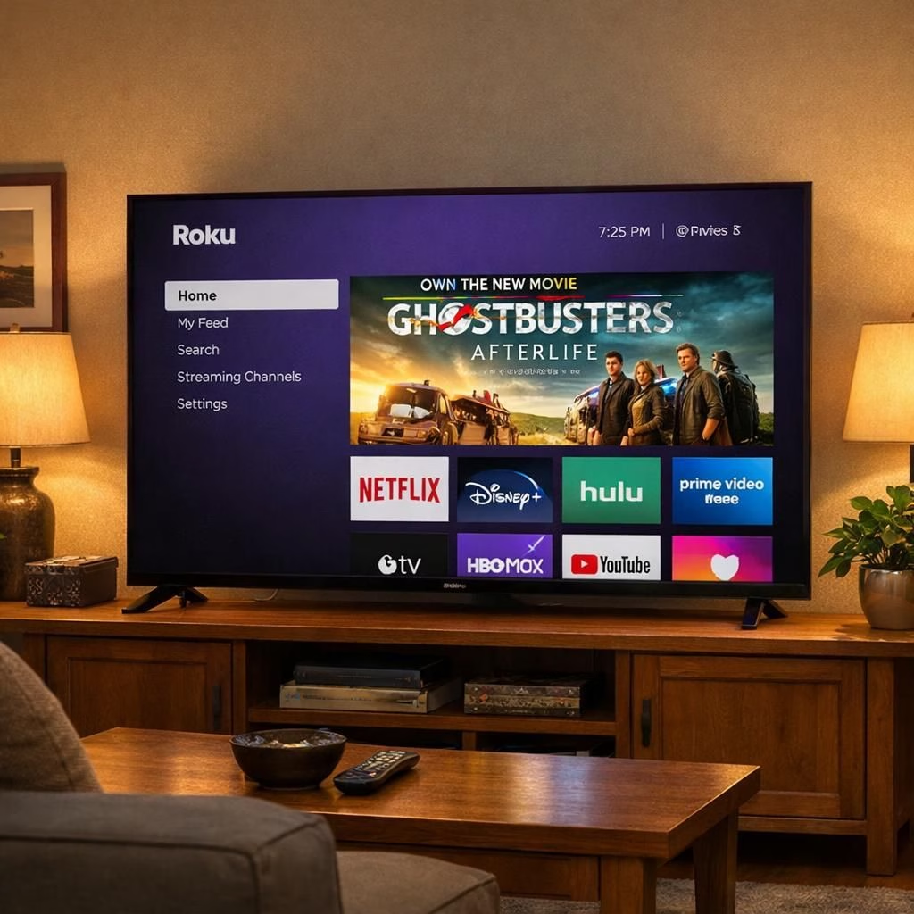
Roku’s home screen just got a crown upgrade, and the crown is a bright, attention-grabbing banner. In 2026, the streaming platform moves toward a more personalized vibe while slipping in a sizable ad—because apparently even your favorite shows need sponsors. Roku, the brand behind the OS you navigate every evening, leans into a more curated home screen experience designed to blend discovery with a touch of commerce without turning the TV into a hostage situation for the remote.
What changed? The big shift is a heavy emphasis on personalization paired with a prominent ad slot that competes for prime real estate. The home screen layout retains the familiar grid and carousels, but the spacing, type, and color palette lean toward a more polished, service-like feel. This isn’t a demolition job; think of it as a thoughtful room rearrangement where the sofa moves a little but the view remains familiar. The result is a more navigable experience that nudges you toward content you might enjoy while making the ad feel like part of the home decor rather than an afterthought.
From a user perspective, there are clear pros and cons. Pros include faster access to recently watched items, smarter recommendations that feel less robotic, and the occasional coincidence that an advertised feature matches your mood—if you binge sci‑fi, the best sci‑fi options bubble closer to the top. The home screen experience has its trade-offs, though, with the sense that sponsorship might steer some recommendations. The balance, for now, keeps the platform usable; the ads appear where they are least disruptive to the core task of pressing the button that starts something good to watch. As with any major UI shift, there will be a learning curve, followed by adaptation, followed by acceptance, possibly with a few grins and eye rolls along the way.
Roku home screen overhaul: what it means for daily use
The new layout invites you to personalize more. You can pin favorite apps, create a curated row of “watch next” items, and adjust which recommendations appear first. The system still respects your privacy settings, but it does push data-driven signals to adjust the order of tiles. If you’re someone who likes minimalism, you might need to prune and fine tune to avoid the home screen dominating the top fold. In practice, the home screen now acts like a tiny personal assistant on a big screen, quietly reminding you of what you already planned to watch, while offering new options that feel tailored rather than random.
Roku home screen and ads: balancing act
At this moment, the ad is not a tiny banner; it’s a sizable block that sits between navigation items. Some readers may feel it disrupts the clean aesthetic, while others appreciate the revenue that keeps Roku free or affordable. The reality is that the line between content and commerce keeps shifting on streaming devices, and Roku is signaling it will test that line with more aggressive placements. The ad can be irrelevant if you never see it, or it can be a helpful nudge to explore a new channel that fits your tastes, depending on your history and preferences.
How to get the most out of the updated Roku home screen:
- Tailor your rows: Move apps around, pin favorites, and set your own order of content to speed up your watch flow.
- Adjust recommendations: In settings, you can influence what gets promoted and what remains a background hum in the room.
- Know where ads sit: The banner typically appears at the top or in a dedicated carousel; treat it as a suggestion stream rather than a hard sell.
- Keep your privacy controls in check: You can limit data usage if you prefer a narrower personalization path.
The long-term question is whether this Roku home screen strategy will pay off in user satisfaction and platform engagement. If viewers respond well, the company will likely roll out refinements, test new ad formats, and perhaps experiment with dynamic banners tied to live events or seasonal themes. If not, expect tweaks, A/B tests, and a few humorous blog posts about a TV interface that kept trying to sell you popcorn with a side of sci‑fi. Either way, the home screen remains the portal to everything else, a quiet gateway to your next binge, a little stage where content and commerce share the spotlight.
In short, the Roku home screen update marks a notable shift in how streaming devices balance personalization with sponsorship. It preserves the familiar rhythm while adding a more polished, dynamic feel and one large banner that demands a moment of attention. If you value control, you’ll appreciate the enhanced ability to tailor rows and prioritize your favorites. If you’re wary of ads, you’ll still find a reasonable means to navigate around them and keep the viewing experience enjoyable. It is, in the end, a pragmatic compromise—one that invites discussion, experimentation, and yes, a little humor about a TV interface that wants to earn its keep without tripping over your socks.
We’d love to hear how you’re navigating the new Roku home screen. Do you find the personalization helpful or intrusive? Have you noticed a specific ad that feels relevant to your tastes, or is it merely background noise? Please share your thoughts in the comments below.
Special thanks to Ars Technica for the original reporting on Roku OS changes: Ars Technica.
References
Further reading from reputable outlets
For broader context, see coverage from The Verge, Deadline, and The Hollywood Reporter: