

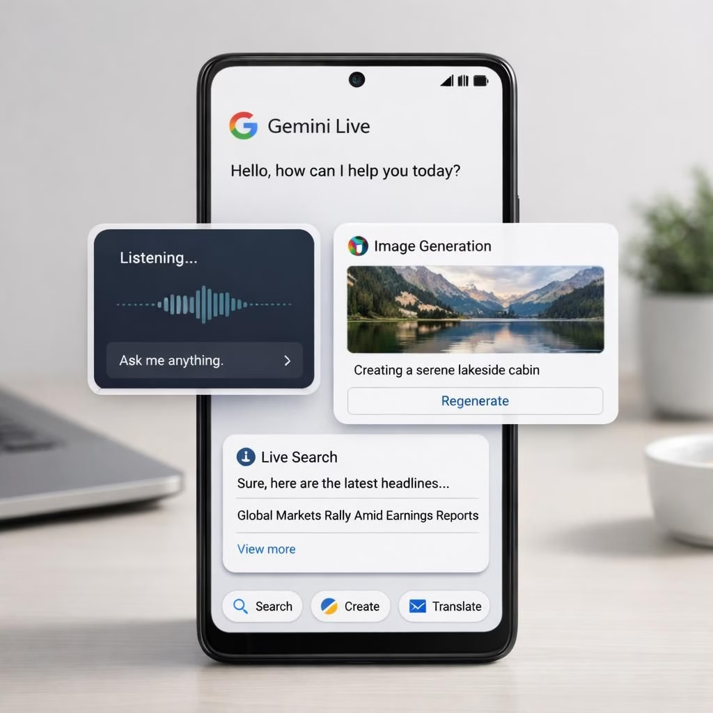
In 2026, Gemini Live introduced an Android UI revamp that shifts away from fullscreen dominance toward floating panels that hover above apps and notifications. The change aligns with Google’s ongoing experiments in interface density, gesture navigation, and contextual menus. Coverage from outlets like 9to5Google and Android Authority tracks the rollout, while NewsBytes and Jetstream.blog offer use-case notes and early impressions. The redesign feels less like a complete makeover and more like a philosophy shift: move decision points to reachable corners of the screen without burying content under a giant frame. If you like your workflows compact and your distractions minimal, this update speaks your language—and it does so with a wink.
Gemini Live: Floating UI Takes Center Stage
At a glance, the floating UI is a sly hinge on top of the old Gemini Live canvas. Gone are the days when taps pulled you into a full-screen mode, only to return you to where you started. Now, a lightweight panel can appear with a quick swipe or a tap on the edge, showing a few essentials: a search box, a quick note tool, and a tiny set of app shortcuts. It behaves like a helpful assistant who hovers nearby rather than a gatekeeper who blocks your view. This keeps the primary app in view and preserves context, which matters when you need to compare prices, track a deadline, or draft a message without losing your place. The result is a smoother initiation of tasks and fewer moments of fatefully tapping the wrong button in a crowded app interface.
Android UI Changes You May Notice in Day-to-Day Use
The core goal of the Android UI revamp is practical: speed up everyday actions without pulling you out of your flow. The floating panel can be summoned in-line while you read, annotate a screenshot, or jot a reminder while continuing to scan the page. The panel design minimizes disruption; it won’t steal your focus unless you want it to. This approach scales gracefully across devices, from compact phones to larger tablets, letting content stay visible while options hover at the edges. On devices with varied screen sizes and resolutions, the effect reads as crisp, responsive, and almost familiar, like a refined feature you didn’t realize you needed until you tried it. It’s polish with a purpose, not a flashy trick just for the launch video.
The Android UI changes are designed to stay out of the way when you’re focusing on content, while offering a quick toolkit when needed. For power users, this means fewer interruptions and faster task initiation, especially during research, note-taking, or messaging on the go.
Gemini Live Meets Android UI: Looking Ahead in 2026
There’s a practical optimism in this direction: keep the AI assistant approachable but reduce friction that separates it from daily work. The redesign implies a broader strategy where developers can expect more modular components, clearer in-app navigation, and a cleaner boundary between content and controls. The design language borrows Android’s patterened wisdom while weaving in Gemini’s characteristic color language and voice. If the rollout continues, other apps may follow Gemini Live in adopting the Android UI approach. We may also see more inline actions, smarter context-aware prompts, and accessible micro-interactions that invite users to experiment rather than hunt for features buried in menus. The net effect could be a more confident yet approachable interface—one that feels capable without demanding constant attention.
From a design perspective, Gemini Live maintains its color language while the UI embraces newer micro-interactions and adaptive layouts. The consolidation of controls near the edges helps content stay readable and scannable, which matters for long reading sessions or quick research bursts.
Of course, no update arrives perfectly packaged for every user. Some power users may miss the more expansive integration points that existed before, such as NotebookLM uploads and certain automation links. Reports from various outlets note that a few features didn’t migrate in the first wave, as teams trimmed back-end flows to keep performance snappy on a broad range of hardware. The trade-off, as testers point out, is a lighter footprint and quicker startup, possibly at the expense of deeper automation. Google’s stance here seems to be: deliver a lean, fast core with room to grow, rather than a feature-packed once-and-for-all sprint. Whether that growth comes as a series of small, well-targeted updates or a more confident mid-cycle overhaul remains to be seen, but the mood is clearly purposeful rather than accidental.
From a user-experience perspective, the new approach rewards patience and curiosity. The UI invites exploration without shouting, and the onboarding feel is gentle enough for new users yet respectful of seasoned ones. The color language stays recognizable, so you never feel lost in the Gemini ecosystem, while the floating panels offer a tangible sense of progress: fewer moments where you pause to remember where you left your task, more moments where you pick up exactly where you want to be. The blend of familiarity and novelty is subtle, but in a busy app market, it can be a notable differentiator.
In the broader tech conversation, the Gemini Live Android UI refresh feels like a case study in balancing control with convenience. It hints at a future where interface density is carefully choreographed to support frequent tasks while preserving screen real estate for content. If more apps adopt this philosophy, we might see a wave of interfaces that feel less like re-skins and more like re-arrangements of how we think about working and playing on mobile devices. The real test will be long-term practicality: does the floating approach age well with multiple app ecosystems, or will it require continual refinements as new use cases emerge?
Original coverage and a note of thanks go to the original reporting that sparked this synthesis. Special thanks to 9to5Google for the detailed coverage of the Gemini Live redesign on Android, which provided the backbone for this discussion. You can read their article here: Gemini Live redesign replaces fullscreen interface on Android. Gratitude also goes to Android Authority, NewsBytes, and Jetstream.blog for their notes during rollout discussions.
Want to weigh in with your own experience? I’d love to hear what you think about the Gemini Live Android UI changes. Please share your thoughts in the comments.
Gemini Live: Quick-start for Android UI power users
To get productive quickly, try these steps for the Android UI panel: open it from the edge, pin your most-used shortcuts, and tailor the tools to match your workflow.
- Summon the panel by swiping from the screen edge or tapping the corner; keep gestures natural to your workflow.
- Choose which tools appear in the panel to minimize interruptions; Android UI essentials should stay within reach.
- Experiment with inline actions when reading or researching, then pin the most-used shortcuts for quicker access.
FAQ
- What is Gemini Live? It’s the redesigned Android UI that uses floating panels to keep content visible while offering quick actions.
- Will NotebookLM uploads return? The first wave trimmed some back-end integrations to keep performance snappy; NotebookLM functionality may return later as the platform evolves.
- How do I use the new floating panel? You can summon it from the edge, then use the included tools to search, jot notes, or access shortcuts without losing your place.
- Is this change universal across devices? The goal is to scale across phones and tablets, preserving content and making controls accessible near the screen edges.
References
- Gemini Live app redesign on Android
- Material Design guidelines
- Gestures and touch interactions in Android