

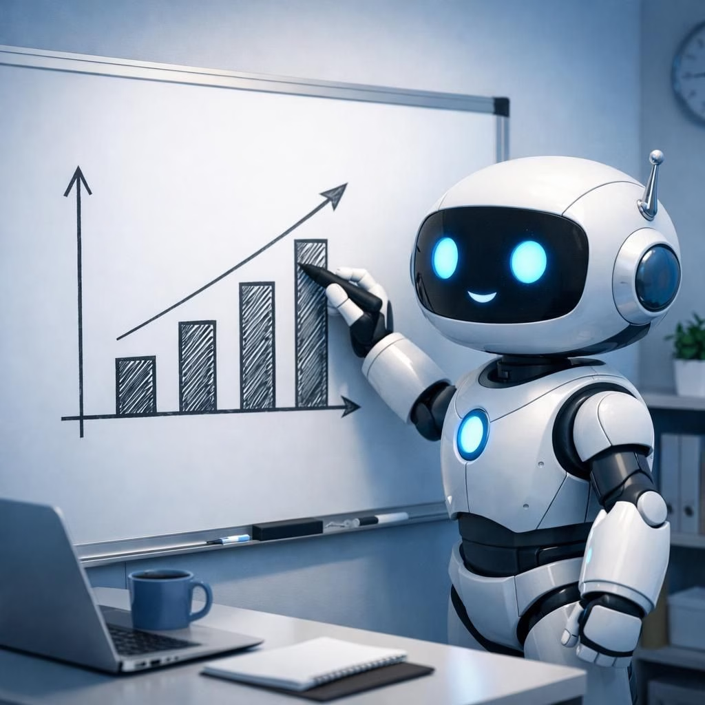
AI and image are no longer buzzwords; they are twin engines powering a quieter revolution: machines drawing and describing pictures with human-like nuance. This piece looks at OpenAI’s latest image engine, keeping headlines friendly and the nerdy bits accessible. In 2026, the practical question isn’t whether the model can fake a photo, but whether it can help a team explain a chart without needing a dozen captions.
AI and image: A friendly tour of the new image engine
To begin, the hands-on reporting from Axios shows a conception-friendly tool that can produce convincing visuals quickly. The system can generate not only stills but captions and small diagrams that accompany the visuals. It can help product teams mock up dashboards, explain a concept, or simply amuse a presentation with charts that don’t require a design team and a long wait. The core idea remains: AI can sketch, while people refine.
In practice, the engine balances speed and clarity. It tends to prefer clean lines, legible labels, and color palettes that avoid shouting at the audience. The result is usable in a slide deck, a prototype, or a quick internal memo. This is not a replacement for a photographer or designer, but a fast first draft that saves time and sparks ideas.
The approach favors safety and structure. The reporting notes a sensible default: visuals should communicate data without overclaiming. Teams can iterate quickly by generating several options and choosing a clean one. This speed helps teams stay aligned in meetings and in the product cycle. AI, by design, thrives on human context and feedback.
AI and image in 2026: charts, diagrams, and practical takeaways
The WIRED piece notes improvements in quality, especially when rendering text inside diagrams. The model can place axis labels and color-coded legends with consistent typography. The catch is occasional misalignment under heavy zoom, which is a reminder to review the output before sharing publicly. The lesson: treat the output as a draft that invites improvement, not a final report.
In corporate use, teams should start with a clear brief: what concept is being illustrated, what audience, and what data source (even if just a placeholder). Then let the tool generate options for layout, color, and labeling. This approach keeps creative risk low while unlocking rapid iteration. The result is a faster path from idea to visuals that people can actually read and interpret.
TechCrunch’s note on Images 2.0 being “surprisingly good at generating text” inside visuals is a reminder that the line between caption and content is blurring. The ability to embed short labels or tiny snippets of explanatory text can save time in early-stage pitches. Yet the trade-off remains: human oversight remains essential to ensure accuracy and avoid misinterpretation.
Business Insider raises a practical concern: the model can convincingly mimic real photos, which demands responsible use, watermarking where appropriate, and strict checks for authenticity in critical contexts. The edge here is not just clever visuals; it is trust. In 2026, trust in AI-generated visuals becomes a feature, not a bug.
Bloomberg’s observation about diagrams notes a strong suit: the engine excels at translating numbers into intuitive visuals. A simple bar graph, a clean grid, or a labeled schematic can appear with minimal effort. The speed and accessibility are real advantages for teams that juggle meetings, dashboards, and quick prototyping.
For creators and teams, the practical takeaways are practical: start with a clear concept, pick a safe domain, and use the tool to spark ideas rather than finalize decisions. The tool shines when it complements human judgment, not replaces it. In 2026, people remain the final editors, while AI does some rough drafting and layout.
As an ongoing trend, the engine can democratize design tasks. A marketing newbie can produce shareable visuals, an engineer can illustrate a concept, and a manager can prepare a quick visual summary for a report. The broader commentary is that AI-assisted visuals are becoming a staple productivity boost, not a gimmick.
Yet there is humor in the mix: you might request a chart, and the tool supplies a diagram that looks almost human—competent but not a replacement for domain knowledge. This intersection of capability and humility is where the technology shines: it invites feedback, it speeds up iteration, and it keeps the human-in-the-loop essential for accuracy and ethics.
In short, the new engine is a practical tool for 2026. It offers better charting, crisper diagrams, and the occasional playful avatar. It’s not perfect, but it is useful, fast, and surprisingly adaptable across disciplines. The best approach is to experiment with safe prompts, set clear expectations, and always review the output with a critical eye.
To close, AI and image are teammates in the modern workflow. When used wisely, they shorten cycles, clarify ideas, and help teams communicate visually with confidence. If you’re curious about how this plays out in your field, try a quick prompt and compare it with your existing visuals. The results can be educational—and entertaining.
Have thoughts about AI and image in 2026? Share your thoughts in the comments.
Linkback attribution: Special thanks to Axios for the original hands-on report: Hands-on with ChatGPT’s powerful new image engine. This post also acknowledges the broader reporting from WIRED, TechCrunch, Business Insider, and Bloomberg for context.
Practical takeaways for teams using the image engine
- Start with a clear brief: concept, audience, data source, and the intended takeaway.
- Choose safe domains: diagrams and charts over photorealistic visuals for critical decisions.
- Iterate quickly on image layouts to improve readability and speed up reviews.
External sources
- WIRED coverage on AI-driven visuals
- TechCrunch coverage on Images 2.0 and visuals
- Bloomberg on charts and diagrams from AI tools