

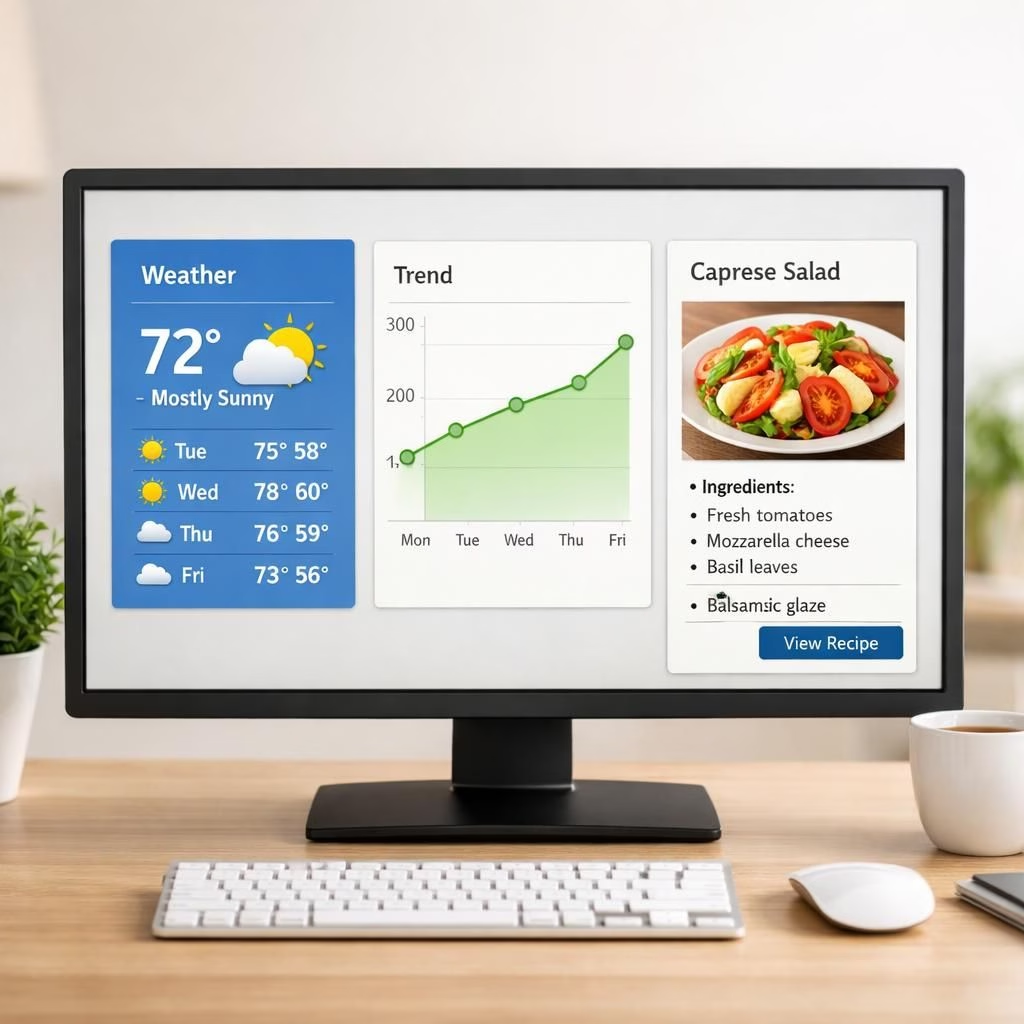
Meet Claude Visuals and Inline Visuals—the AI update that trades blocky text for welcome visuals. Claude Visuals brings charts and diagrams into answers when they help, not when they clutter. Inline Visuals insert visuals inside the chat flow, not as a separate slide, keeping explanations crisp and a touch more human. The upgrade aims for practical assistance with a dash of playfulness. You can still request plain text, but visuals improve speed and clarity.
What you get is a shift from word soup to focused visuals. Claude Visuals can render charts, graphs, and diagrams using HTML and SVG. They remain distinct from artifacts, so they stay lightweight and fast. Inline Visuals turn insights into visuals inside the answer, while the system decides when a visual helps more than text. If you prefer, you can ask for a purely text reply. The guiding idea is simple: visuals first, prose second, with both Claude Visuals and Inline Visuals playing supporting roles.
On desktop, Claude Visuals shines with weather data and recipe cards. Inline Visuals appear as part of the answer rather than a separate widget. For mobile, rendering is not guaranteed yet, so expectations stay realistic while we test on larger screens. These visuals showcase potential without disrupting the core experience.
Interactivity adds bite. Claude Visuals can ask structured questions with multiple choice inputs, letting you respond by clicking. Visuals help compare options and verify information, and Inline Visuals keep the same interactive flow, so the conversation remains consistent. You can still type your answer if you prefer.
Accessibility and readability are priorities. The visuals use HTML/SVG, enabling scalable design that works with screen readers. For content teams, visuals reduce cognitive load and improve retention. The system aims to be approachable and reliable. The dual-tag design helps readers and search engines recognize Claude Visuals and Inline Visuals value.
Claude Visuals: Practical Uses
- Weather at a glance: a weather card shows icons, temperatures, and trends; a forecast line or bar chart sits beside the text.
- Recipe cards: steps, times, and ingredients are laid out in a clean, easy-to-follow format.
- Inline Visuals in action: mini charts slide into the narrative, keeping the flow cohesive.
When data matters, Claude Visuals can tell the story with a quick, image-free diagram. For teams, this speeds review and improves memory retention. Inline Visuals integrate into the same content with compact visuals, balancing information density and readability.
Inline Visuals: How It Works
Inline Visuals rely on HTML and SVG and render inside the chat as part of the response. They adapt to screen size and maintain accessibility. Interactive MCQ inputs are part of the toolbox, letting you answer with a click. If you want a weather forecast or a data trend, Inline Visuals can show it as a diagram rather than long rows of numbers. The result is a consistent, readable experience that respects your time.
Whether you are a reader or a builder, Claude Visuals and Inline Visuals offer a practical upgrade. You gain faster comprehension, easier verification, and a small dose of delightful design. The balance of visuals and text keeps information accurate and approachable. And yes, you will want to share your own experiments with visuals in conversation.
If you’ve tried Claude Visuals or Inline Visuals, please share your thoughts in the comments below—your experiences help others navigate this new toolkit.
Original article: https://www.anthropic.com/blog/claude-inline-visuals — Thank you to the Anthropic team for the original material.
External readings: NOAA (weather data context) and MDN: SVG offer useful background on the visual formats Claude uses. For accessibility best practices with scalable visuals, see MDN Accessibility.
FAQ
- What are Claude Visuals and Inline Visuals? They are visual tools built into Claude’s responses to convey information more clearly, using HTML and SVG for lightweight, accessible graphics.
- Can I disable visuals? Yes. You can request a plain-text reply if you prefer, and the system will provide it when visuals aren’t needed.
- Where do the visuals appear? On desktop, visuals appear in the article body alongside text. On mobile, some visuals may not render yet, pending further testing.
- Do visuals affect accuracy? No. They augment the explanation; core facts still come from the text, with visuals helping to compare data and verify details.
Conclusion
Claude Visuals and Inline Visuals offer a practical upgrade that boosts clarity without sacrificing nuance. If you frequently read data-heavy explanations, this approach can cut cognitive load and speed understanding. Explore how visuals can fit your workflow, and share what works in your conversations.
References
- Original source: https://www.macrumors.com/2026/03/12/claude-visuals-conversations/
- Anthropic blog on Claude visuals: https://www.anthropic.com/blog/claude-inline-visuals
- MDN SVG overview: https://developer.mozilla.org/en-US/docs/Web/SVG
- MDN Accessibility: https://developer.mozilla.org/en-US/docs/Web/Accessibility