Introducing the New Google Phone Keypad
In a world where smartphones reign supreme, the Google Phone keypad has undergone a delightful makeover. Yes, you heard it right! In 2025, Google decided that it was time for a change, and they’ve transformed the keypad from drab to fab. This redesign not only catches the eye but also enhances usability—because who doesn’t want to dial with a bit of flair?
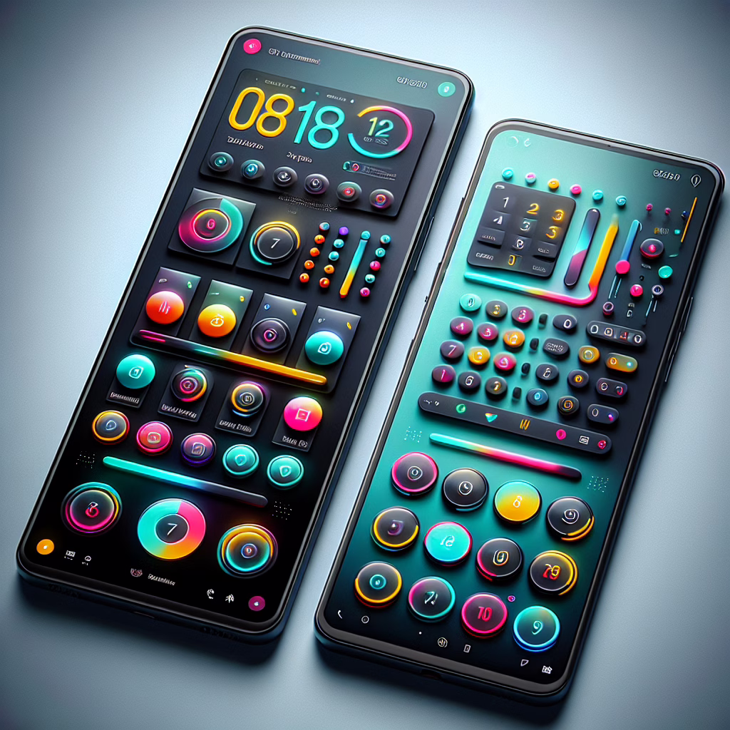
The Colorful Changes
Gone are the days of bland monochromatic numbers! The revamped Google Phone keypad now flaunts vibrant colors that bring a splash of joy to your dialing experience. Each number is now encased in its own cheerful bubble, making it feel like you’re tapping on candy rather than just your average phone keypad. Who knew that a little color could make such a big difference?
This redesign also focuses on accessibility. Google has ensured that the color contrast is not just pretty but practical too. With clearer visibility for those of us who might need reading glasses—or maybe just a better excuse to avoid them—everyone can enjoy this new feature without squinting like they’re trying to read hieroglyphics.
User Experience: A Dialing Delight
The user experience has been elevated to new heights (or should we say, more colorful depths?). Each number is larger and more spaced out than before, making accidental butt-dials a thing of the past—at least we can hope so! The keypad now feels more responsive; it’s as if it’s saying, “I’m here for you!” with each tap.
But wait, there’s more! With this redesign, Google has incorporated haptic feedback that feels like a gentle nudge on your fingertips every time you press a key. It’s almost as if your phone is giving you a high-five for making that call. This tactile sensation adds an extra layer of engagement, making dialing feel less like a chore and more like an interactive game.
Why Redesigning Matters
You might be asking yourself, why does a redesign matter? Well, let’s face it: in today’s fast-paced world, our phones are practically extensions of ourselves. A well-designed keypad not only makes our lives easier but also reflects our personal style. The vibrant new look of the Google Phone keypad aligns perfectly with current design trends that prioritize both aesthetics and functionality.
Moreover, staying updated with design trends helps keep users engaged and excited about their devices. It’s like getting a fresh haircut or buying a new outfit; sometimes you just need that little boost of confidence that comes from something new!
The Future of Dialing: What’s Next?
As we look ahead in 2025 and beyond, one can only wonder what other innovations Google has up its sleeve for our beloved smartphones. Will we see voice-activated dialing that responds to our every whim? Or perhaps an AI assistant that suggests numbers based on our past calls? The possibilities are endless!
Whatever the future holds, one thing is certain: the new Google Phone keypad is setting a high bar for user experience in mobile technology. It’s not just about calling anymore; it’s about enjoying the journey every time you pick up your phone.
Your Thoughts?
What do you think about this colorful transformation? Are you ready to embrace the new Google Phone keypad? Share your thoughts in the comments below! We’d love to hear how this new design resonates with you.
For those who frequently use devices with a numeric keypad, consider exploring our further insights on the [keypad](https://www.geekyopinions.com/tag/keypad). Each update matters!
Thank you to 9to5Google for the original article!