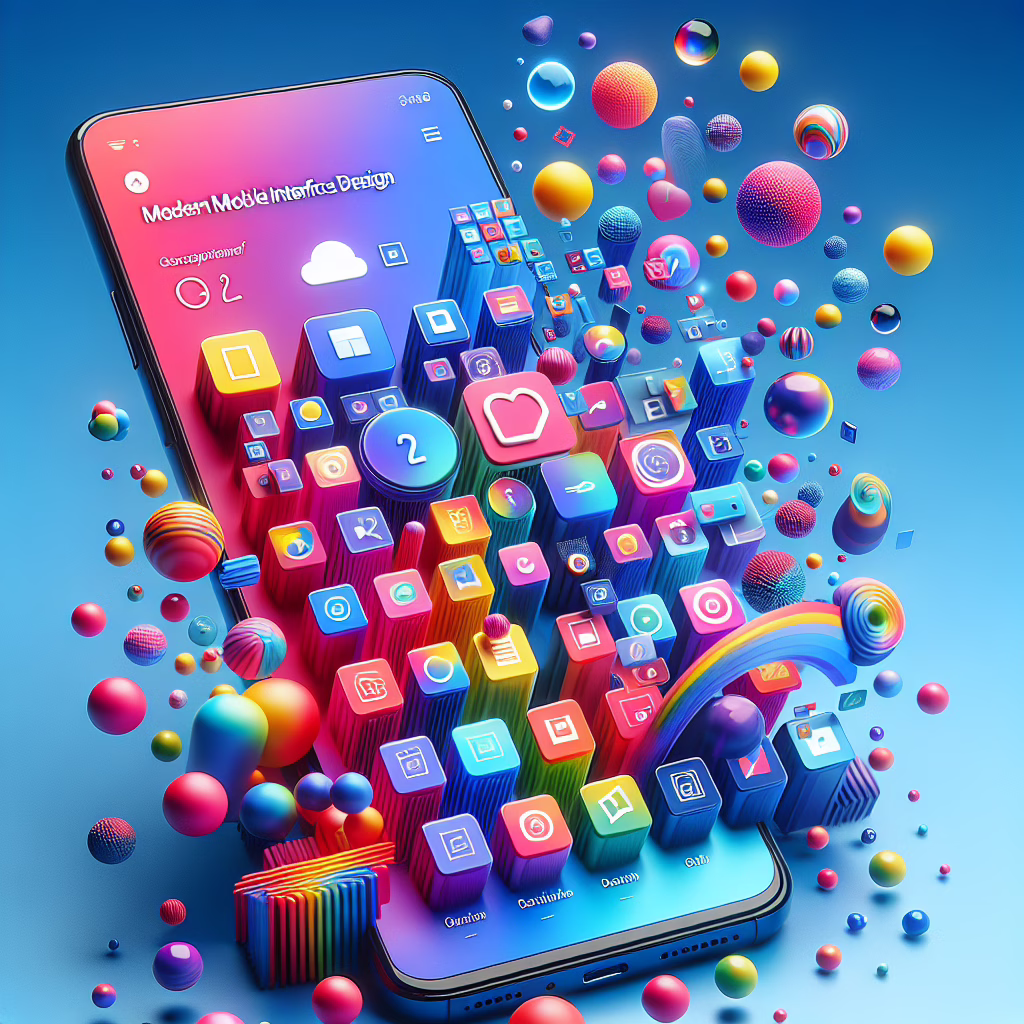
In the ever-evolving world of design, Google Material 3 has stepped onto the stage like a confident performer ready to dazzle us with its new tricks. This latest iteration of Google’s design language is not just a facelift; it’s a complete makeover that emphasizes expressive redesign while keeping functionality at the forefront. The year is 2025, and if you thought design trends couldn’t get more exciting, think again!
The Charm of Expressiveness in Google Material 3
Imagine walking into a room where every wall tells a story, where colors dance and shapes sing – that’s the essence of Material 3. This redesign brings a delightful blend of creativity and usability. Gone are the days when apps looked like they were stuck in a time warp. With Material 3, Google invites users to embrace a more personal and engaging interface.
One of the most thrilling features is the introduction of dynamic color capabilities. Depending on your wallpaper, your apps can now change hues like a chameleon at a disco party! This feature allows users to create an interface that reflects their personality or mood – whether you’re feeling vibrant like a summer day or calm like a cozy winter evening.
Making Usability Fun Again
Usability might sound dry, but let’s face it: we need functionality as much as we need our morning coffee! Google understands this perfectly. With Material 3, navigation becomes intuitive, making it feel less like work and more like a leisurely stroll through an art gallery. The design updates prioritize accessibility and ease of use, ensuring that everyone can enjoy the beauty without feeling lost in translation.
Also, the new typography system is like hiring a personal stylist for your text! Fonts are more legible and adaptable across devices, ensuring your words look fabulous whether you’re on a smartphone or a tablet. If only we could apply this concept to our wardrobes!
What’s New in Google Material 3?
The expressive redesign includes several noteworthy enhancements. For starters, there’s an emphasis on motion. Buttons now have personality; they bounce when you click them! Well, maybe not literally bounce (unless you’ve had one too many coffees), but they do respond with delightful animations that give feedback in real-time.
Moreover, components are modular—think of them as building blocks for your digital experiences. Developers can mix and match these components to create unique applications without needing to reinvent the wheel each time. It’s like playing with LEGO but for grown-ups who build apps instead of castles!
The guidelines for developers have also been simplified. Yes, this means fewer headaches over design specifications! More focus means that developers can create faster while maintaining quality. Talk about winning the productivity lottery!
Embracing Personalization with Google Material 3
Personalization is all the rage these days – after all, who wouldn’t want their tech to reflect their unique style? With Material 3’s expressive redesign, Google encourages users to customize their interfaces. From colors to shapes, everything is tailored to meet individual preferences. No more cookie-cutter designs!
This trend towards personalization extends beyond just aesthetics; it also influences how users interact with their devices. With features designed to adapt based on usage patterns and preferences, Google ensures that each interaction feels tailored and intuitive.
The Future Looks Bright (and Colorful)
The future of design is not only about making things pretty but also about creating meaningful and functional experiences. Google Material 3 is paving the way for this future with its expressive redesign that seamlessly combines beauty and usability.
As we navigate through 2025, expect to see more applications adopting these principles from Google. This shift will likely inspire other designers to step up their game and rethink how they approach user interfaces.
In conclusion, Google Material 3 isn’t just about slapping on new colors; it’s about enriching our digital lives with thoughtful design choices that resonate with us personally. So go ahead, dive into this colorful world where design meets expression—your apps will thank you for it!
What are your thoughts on Google Material 3’s expressive redesign? Have you noticed any standout features or changes? We’d love to hear your insights in the comments below!
Special thanks to 9to5Google for their original article that inspired this piece!
Understanding Google and Material Design Principles
The foundation of Google’s design language lies in its commitment to enhancing user experience through visual and functional coherence. Material Design emphasizes a three-dimensional approach to user interfaces, offering depth through layering, shadows, and movement.
- Depth and Dimension: Use subtle shadows to create layers.
- Motion and Interaction: Every action has a reaction; smooth transitions guide users.
- Consistency Across Platforms: Users expect a unified experience across devices.
These principles culminate in a holistic approach that ensures users intuitively understand how to interact with their devices. As we embrace Google Material 3, it’s crucial to understand that this isn’t just design; it’s a philosophy that prioritizes the user above all else.
In light of this, keep an eye out for exciting developments and applications adopting these guidelines, enhancing overall user experience. Remember, the beauty of design is in its ability to evolve and adapt!