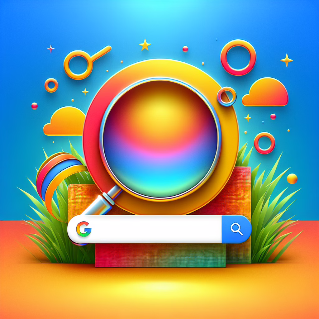
In the ever-evolving world of digital design, Google has decided it’s time for a makeover—again! This time, they’ve traded in their classic flat colors for a splashy gradient that’s sure to make you do a double-take. Yes, that’s right! Google’s logo has undergone a delightful transformation as part of their 2025 branding strategy, proving once and for all that even tech giants can have fun with their aesthetics.
The Gradient Effect: A Colorful Choice
Gone are the days of static logos that look like they were pulled straight from a 1990s graphic design class. Google has embraced the vibrant trend of gradients, which are all the rage in web design this year. This update is not just about looking good; it’s about making a statement in a world where everything seems to be flat and minimalistic.
The new gradient logo is a playful nod to creativity and innovation. It features shades of blue, red, yellow, and green that seamlessly blend into one another. Think of it as Google’s way of saying, “We’re serious about our tech, but we also love a good color party!” The choice reflects a broader industry trend where brands, including Google, are experimenting with color to evoke emotions and create memorable visual identities.
Why Gradients? The Psychology Behind the Shift
But why gradients? Well, it turns out that colors affect our feelings more than we realize. Gradients can create depth and dimension, making designs feel more dynamic and engaging. They invite users to explore, much like how Google invites us to explore the vast universe of information at our fingertips.
This design shift aligns perfectly with Google’s mission to make information universally accessible and useful. By adopting a more vibrant logo, Google aims to reflect its innovative spirit while connecting with users on an emotional level. After all, who wouldn’t feel a little happier seeing a splash of color when searching for their favorite cat videos?
Reactions from the Design Community
The reaction from the design community has been mixed but mostly enthusiastic. Some designers have praised Google for embracing modern design trends, while others have quipped that they didn’t know logos could be so dramatic. “What’s next? Animated logos?” one designer joked. However, most agree that this fresh look is a bold step forward.
Many see this change as an opportunity for brands everywhere to rethink their identity. If tech behemoths like Google can step away from tradition and embrace vibrant designs, then perhaps it’s time for smaller businesses to consider adding a little flair to their own logos. A splash of gradient could just be what your brand needs to stand out in the crowded digital marketplace!
The Technical Side: What Does This Mean for Branding?
From a technical perspective, the implementation of gradients in branding isn’t just about aesthetics; it involves strategic thinking. Gradients can enhance brand recognition and recall by making logos more visually appealing. According to experts, when users see an engaging logo, they are more likely to remember the brand associated with it.
Additionally, gradients offer versatility across various platforms. Whether on mobile apps or desktop websites, these colorful creations can adapt beautifully without losing their essence. So, whether you’re scrolling through your phone or staring at your laptop screen during yet another work-from-home day, you’ll be greeted by Google’s cheerful new look!
Conclusion: A Colorful Future Awaits
As we step further into 2025, we can expect more brands to follow suit and embrace this colorful wave of change. Who knows? Maybe soon we’ll see corporate logos featuring rainbows or even tie-dye effects—now that would be something! In any case, let’s raise our virtual glasses (or coffee mugs) to Google for daring to color outside the lines.
What do you think about Google’s gradient makeover? Are you ready for more brands to jump on the colorful bandwagon? Share your thoughts in the comments below!
A big thank you to The Verge for inspiring this colorful exploration into Google’s new logo!
For more insights on branding and design evolution, check out our article on How a designer turned an iPad and Apple Pencil into the heart of a creative business. You might also like our take on Google’s new AI video feature, which showcases how innovation continues to shape our digital landscape.