Ah, the sweet symphony of tech updates—like a well-timed coffee break but with fewer spills! In June 2025, Google graced us with its latest aesthetic marvel: the shiny new Gemini icons. These eye-catching icons are not just about looking good; they’re also about enhancing your digital experience. Let’s dive into this delightful world of design and discover how these new icons could brighten up your online endeavors.
The Birth of a New Era in Design
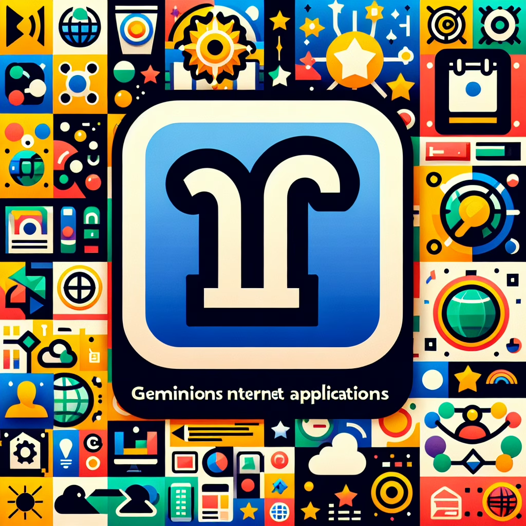
With the unveiling of the Gemini icons, Google signals a shift that can only be described as a fresh breeze in a stuffy room. The sleek design features softer shapes and vibrant colors that invite users to engage more deeply with their applications. Gone are the days of squinting at drab icons that seem to have lost their sparkle! Instead, we have an array of lively visuals that scream, “Click me!” without uttering a single word.
But what makes these Gemini icons so special? Well, they’re not just pretty faces. The design focuses on improving user experience (UX) by making everything more intuitive. The icons are crafted to make navigation feel seamless—like floating through a digital wonderland!
Understanding the Gemini Icons’ Impact on User Experience
Now, let’s talk about how these icons might just change your life—or at least your daily tech interactions. Each icon is designed to represent its function clearly while also being visually appealing. For instance, the new Gmail icon no longer looks like it was hastily drawn during a coffee-fueled all-nighter. Instead, it embodies a friendly envelope that beckons you to check your messages.
This thoughtful redesign is more than skin deep; it’s about creating emotional connections between users and their tools. When you see an inviting icon, you’re more likely to engage with the app—and isn’t that what we all want? To avoid those awkward silences with our devices?
Colors That Pop: A Visual Delight
The color palette for the Gemini icons is nothing short of exhilarating! Bright hues combined with subtle gradients offer a feast for the eyes—think of it as a colorful smoothie for your digital landscape. The vibrant colors not only catch your attention but also help distinguish between different apps quickly. No more mistaking your calendar for your photo gallery; that would be quite the mix-up!
Moreover, these colors cater to those who might be colorblind. With improved contrast and clear differentiation among shades, Google aims for inclusivity in its designs. Now everyone can enjoy the visual delights these icons offer!
Functionality Meets Aesthetics
You might wonder: can beauty really enhance functionality? Well, dear reader, when it comes to the Gemini icons, the answer is a resounding yes! By marrying aesthetics with practicality, Google has created an interface that encourages users to explore features they might have previously overlooked.
Imagine opening up an app and instantly feeling welcomed by cheerful graphics. You’re more likely to dive into new features when they’re presented so invitingly—it’s like being lured into a candy store with promises of delightful treats!
A Step Towards Future Innovations
The introduction of these Gemini icons hints at Google‘s commitment to continuous improvement in design and technology. As we leap into 2025, one can only imagine what other surprises Google has in store for us! Perhaps holographic interfaces or voice-activated wallpapers? Okay, maybe I’m getting ahead of myself—but wouldn’t that be something?
In any case, as we embrace these new designs, let’s remember that innovation often begins with simple changes that encourage us to interact differently with technology.
So there you have it! The shiny new Gemini icons not only enhance aesthetic appeal but also enrich user interaction across Google’s platforms. If you’re not already excited about this update, consider this your friendly nudge to dive in and explore all that these vibrant designs have to offer!
What do you think of Google‘s new Gemini icons? Are they a refreshing change or just another pretty face? Share your thoughts below—we’d love to hear from you!
And last but certainly not least, thank you to 9to5Google for providing insights on this exciting development!