Android Material 3 has arrived, and let’s just say it’s ready to party! This latest version of Google’s design language invites everyone to get creative with user interfaces (UI) like never before. With expressive design elements that bring a splash of personality, we’re diving into how Material 3 is redefining the digital landscape.
What is Android Material 3?
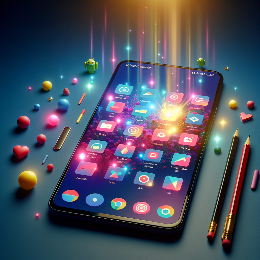
For those who might be wondering what all the fuss is about, Android Material 3 is the newest iteration of Google’s design system. Think of it as a makeover for your favorite app, but instead of a new hairstyle, it’s about vibrant colors, playful shapes, and delightful animations. The goal? To make our digital experiences feel more human and less robotic. Android developers can finally create interfaces that resonate with the essence of each unique user.
Expressive Design: The Heart of Material 3
One of the standout features of Android Material 3 is its emphasis on expressive design. Gone are the days when apps looked drab and uniform. Now, with customizable components and dynamic theming, developers can create UIs that embody the user’s personality. Whether you prefer a calming pastel palette or an electrifying neon vibe, there’s something here for everyone!
But what does this mean for you? It means that your apps can now mirror your mood or even your coffee choice—energetic for espresso lovers and laid-back for those sipping herbal tea. This kind of personalization isn’t just fun; it enhances usability too. A well-designed UI can make navigation feel intuitive, leading to happier users and fewer puzzled faces staring at their screens.
The Power of Color in Material 3
Color plays a pivotal role in Android Material 3. Picture this: you open an app, and instead of bland greys and whites greeting you like an over-caffeinated accountant, you’re welcomed by a symphony of hues that dance across your screen. This version introduces dynamic color, which allows apps to adapt their color schemes based on user preferences or even the wallpaper on their device.
Imagine walking into your favorite café, where the walls change color based on your mood! Okay, maybe not exactly like that, but you get the idea. Users can expect their apps to feel fresh every time they open them. This feature could also spark creativity among designers as they experiment with new palettes and gradients.
User-Centric Features to Love
Material 3 isn’t just about looking good; it also focuses on enhancing accessibility. With features that cater to diverse needs, it ensures everyone can enjoy a seamless experience. For instance, larger touch targets make it easier for those with less-than-perfect precision (we’ve all been there) to navigate through apps without a struggle.
The design system also supports adaptive layouts, meaning developers can create interfaces that automatically adjust based on screen size or orientation. No more squinting at tiny text on our phones or tablets!
A Community-Driven Approach
What’s more delightful than a fresh design? A community rallying behind it! Android Material 3 encourages collaboration between designers and developers. By fostering an environment where feedback is welcomed and innovation is celebrated, Google ensures that this design system evolves with its users’ needs in mind.
This collaborative spirit is reminiscent of a potluck dinner: everyone brings something unique to the table, resulting in a feast of creativity that no one person could have cooked up alone.
Conclusion: Embrace the Future with Android Material 3
The future looks bright—and colorful—with Android Material 3 leading the way! With its focus on expressive design, accessibility, and community involvement, it represents a leap forward in UI design. So go ahead, update your apps or give your favorite ones a fresh look! Your fingers (and eyes) will thank you.
We’d love to hear your thoughts on Android Material 3! What features are you most excited about? Share your comments below!
A special thanks to The Verge for the original article that inspired this piece! For more detailed insights, you can check out our post on Google’s new look with Android 16.